Thursday, 31 August 2006

Edit HTML for templates in Blogger Beta released

It is here! Big excitement!! You can now edit your new Blogger Beta template. I have just found out and am researching it. At first glance it seems things are a little different. Just scanning the documentation, the new template language is completely different from the original one. There is much talk about widgets and sections...oh my.

So, above all, save your template before doing anything. Another way to experiment without damaging your orginal template beyond repair is to open an experimental blog and paste your template in. Go from there.

Here are a few links to get you started:


post signature

Make your own offical seal


I don't know why, but anytime I can make something...a button, logo, seal, header...it makes me happy. Here is my newest find the Official Seal Generator. Much happiness!!! It was pretty large, so I resized it to half the orginal size. Pretty nifty.

post signature

Wednesday, 30 August 2006

Fluid 3 column Blogger template

I was inspired to the point of acting on it. The post by George Mikos made me realize that I wanted had to have a fluid CSS template. The thought of my blog expanding to fit each and every reader's computer display was very tempting. So, throwing caution to the wind, I jumped in.

It was relatively simple. Realizing the sum total must be 100% and I had three columns...two sidebars and the main content...I did some simple math. I first addressed the entire content:
  • left margin 5%
  • right margin 2%
  • width 93% (this 93% contains the main and two sidebars)
I then assigned these values: (Follow me here. This is 100% of the above 93%)
  • main 50%
  • sidebarleft 22%
  • sidebarright 22%
  • 6% for the space between the columns

To actually edit the template, I located #content, #main, #sidebarleft and #sidebarright in my style sheet. In each one of those I edited the width property by removing the px value and replacing it with the % value. For example:
#main {
width:410px;
float:right;
}

changed to:

#main {
width: 50%;
float:right;
}
I tried different percentage amounts for the sidebars and main, until I found what I liked.

There is controversy over fixed vs fluid design. I had fixed and was never really happy with the way it displayed on different displays. I like the fact that now my page looks like it was made for each and every display. No large expanse of unused whitespace. I know...I like whitespace as much as the next person. It is striking when it is part of the design. Not when it is only there because of the limitations of a fixed template source.

Then there are schools of thought on the optimum line length for ease of reading. Some say 12-15 words are best or 55 characters. Others say longer lines are better. For me, I don't think it will be such an issue because I have three columns. But, I do have another little trick in mind, and I will write about it when I get it working!

So, let me know what you think. What computer display you use, and how do you like it? Any suggestions?

post signature

Monday, 28 August 2006

Customizable blogger template

Yes, artistic standards. The source should look pretty. Although authoring HTML and CSS is a decidedly left-brained, analytic activity, the right brain's capacity for gestalt can play a valuable role.RealityTopia

This article at RealityTopia Blog gets into the inner workings of a template. George Mikos wrote his own template source out of a need for an easily customizable Blogger template. He not only shows you the how, he explains why. I am able to learn much easier if I know the reason behind doing something, and he certainly provides that. The article is easy to read and interesting. Much like his template source which he takes great pride in. And he should.

I fully intend to study his methods more. I am interested in it all, but especially in the use of the CSS float property to dynamically access the entire width of a computer display screen, be it 1024 x 768 or 800 x 600.

There is much to digest in his post. I highly recommend looking it over if you have any interest in building your own template.

post signature

Tuesday, 22 August 2006

LibraryThing widget for your blog

LibraryThing allows you to put your book titles online. You can enter 200 titles for free. For an unlimited amount of books, it is $10 for a year and $25 lifetime membership. Joining is extremely simple...no first name, last name, secret question, email address, repeat email address, jumping through hoops. Adding books to your collection is as easy as joining. Just type in the title or author. A selection will come up and you click a title. After joining and adding some books, you are able to see who shares the same books. There is an active forum for discussing books and anything else you want to get off your chest.

If you want to share your collection in your blog sidebar, a widget is offered. You can configure it as you like.

Here is my little widget.


post signature

Friday, 18 August 2006

Customizing your header - Web2.0 Logo Creator

Here is another little fun thing I came across...Web2.0 Logo Creator It was meant to be a paradoy of Web2 Logos. But, it is still eye catching. I had entirely too much fun with it.

post signature

1 easy step to improve search box design

I stumbled upon a great little bit of code called Beautiful Form. It was written for Stylist, a program that is to CSS what Greasemonkey is to javascript. (So, it doesn't show up in Internet Explorer.) I liked it so much and wanted it to be incorporated into BlogU. So, I copied the code, made a few changes so it would blend with my blog and put it in the stylesheet. Here is what the search box looked like before and after:


Here is the code that I used:
@-moz-document url-prefix(http) {
/* change the buttons*/
input[type="reset"], input[type="submit"], button
{
-moz-border-radius: 0.5em !important;
border: 1px solid #CCC !important;
border-bottom: 1px solid #CCC !important;
background-color: #EEE !important;
color: #555555 !important;
}
input, textarea
{
-moz-border-radius: 0.8em !important;
}
input, textarea,select
{
background-color: #FFF !important;
border-top: 1px solid #C3C3C3 !important;
border-right: 1px solid #C3C3C3 !important;
border-bottom: 1px solid #C3C3C3 !important;
border-left: 1px solid #C3C3C3 !important;
color: #555555 !important;
}
/*change them on focus with a blue border*/
input:not([type="button"]):not([type="reset"])
:not([type="submit"]):not([type="checkbox"])
:focus,textarea:focus
{
-moz-outline-radius: 0.8em !important;
}
input:not([type="button"]):not([type="reset"])
:not([type="submit"]):not([type="checkbox"])
:focus, textarea:focus, select:focus
{
-moz-outline: 2px solid #ccc !important;
-moz-outline-offset: -1px !important;
}
/*rollover effect on the buttons*/
input[type="submit"]:hover,input[type="reset"]
:hover,button:hover {
border-color: #E8E9E8 !important;
border-bottom-color:#E8E9E8 !important;
background-color: #FCFCFC !important;
}
}
If you prefer to start with the orginal code, you can find it at userstyles.org.

post signature

Wednesday, 16 August 2006

I Did the Blogger Beta Switch

The feeling of impending doom was over-powering, but I simply could not help myself. I was extremely scared hesitant to do the switch, but after extensive research I felt reasonably safe in switching. Not many of you know this, but I have this...well, let's call it a condition. Dilbert has the same condition.
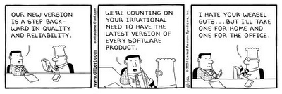
A few concerns I had:
  1. Will my template that I have tweaked and hacked survive the move?
  2. Will I be able to edit the template as before?
  3. Will my URL be changed?
All of these concerns, plus concerns I didn't even realize I should be worried about, were answered over at FreshBlog by Pete and John.

The switch went smoothly, especially since I already had a Gmail account. I know there are some bloggers that have to wait. What made me so special, I have no clue. But, I'm feeling rather superior none-the-less. (They probably drew my name out of a hat.) Anyway, after I got over myself, I got down to business. I logged in and they sent me an email when the 'migration' was complete. Finally I was able to log in and see exactly what was left of my blog. Much to my suprise, it was intact. (Things like that never happen to me. Usually after some big upgrade, I end up having to reformat my computer.) I stuck with the 'edit html' option and shyed away from 'customize design', as tempting as it was. In doing so, I am unable at this time to do anything with many of their new features. But, I suspect it will be coming, as they said the new beta is not complete.

I did get a fancy new navbar that makes working on your blog a click away. And, publishing the blog is a breeze now...no more waiting...waiting...waiting. It is instant! Plus I noticed that on the 'edit posts' page, it shows how many comments you have for each post. Nice. Another new option is a private setting for those of you with deep dark secrets!

The catagory (aka Blogger labels) thing I'm not too sure about yet. I like using FreshTags and having all my catagories picked up by del.icio.us and Technorati. But, I think it will be fun playing with all the new features when they become available to those of us that are not planning to go with the cookie-cutter, plug & go customized templates. Not that it is bad, it just isn't my cup of tea.

All in all, a great upgrade. I'm happy to know they haven't forgotten us.


post signature

Saturday, 12 August 2006

Keep track of Comments/Conversations with coComment

...see when people have added other comments to the discussion...

One of the perks of blogging is the easy interaction between the participants. Comments are the backbone of blogging. With the use of comments a blogger is able to get feedback, answer questions and get to know his/her readers on a more personal level. But, with all the blogs out there and all of the comments, it becomes quickly difficult to remember where you left a comment.

coComment to the rescue! I first found out about this from Blog-Blond. coComment was exactly what I've been looking for.

Previously I would comment on a post and think I would never forget where that blog was. Guess what? I did forget. Time and time again. But, those days are long gone. They couldn't of made it any easier. One less thing on my mind. I would highly recommend giving coComment a try. You won't be sorry.

post signature