Thursday, 21 December 2006

Postbar - something new!

Here is a new one for you. I'm calling it a Postbar in the spirit of previous 'bars'...ie widebar and sidebar. Applications? Well, I wanted an extender to keep my sidebars from moving to the left on label pages.

To explain a bit, I installed the widebar above the right and left sidebars. When I clicked on a label in my category cloud, if I only had a post or two in that category, that made a short list. Then my left and right sidebar, without any prodding from me, shifted to the left to fill up the empty space under that short list. I didn't like that added feature! I wanted all my sidebars to line up in a row like on my home page.

One solution offered was padding the posts to fill space. (And a very nice suggestion. Thanks, Vivek.) Only that left entirely too much white space for my liking. But, it made my sidebars line up. So, I thought instead of putting white space after my posts, why not fill it with something? Hence the Postbar was invented because it is a sidebar that follows the posts.

If you want your very own Postbar, here is what you do. Add the following code to your CSS style sheet (between the <head> and </head> tags):

#postbar-wrapper {
width: 44%;
float:left;
padding-bottom:10px;
word-wrap: break-word; /* fix for long text breaking sidebar float in IE */
}
#postbar {
width: 100%;
padding:10px 0 5px 0px;
word-wrap: break-word; /* fix for long text breaking sidebar float in IE */eak-word; /* fix for long text breaking sidebar float in IE */
}
Note: this is for a fluid template design. If you have a static design, plug in your post px sizes. My posts are called #widebar-wrapper in my template. Yours could be labeled differently.

The following code needs to be added between the <body> and </body> tags. Then find <div id='leftsidebar-wrapper'>. (Again your's could be called something similar.)
<div id="postbar-wrapper">
<?xml:namespace prefix = b /><b:section class="sidebar" id="postbar" preferred="yes">
</b:section></div>
After that, save your template and go to the Page Elements. If it is not lined up under your 'Blog Posts' widget, drag the 'Blog Posts' widget to it, then move it all where you want it. This was a gray area for me. No rhyme or reason...lots of dragging. At one point, it wouldn't let me drag a widget, but I saved it and came back and I could move it. Then it worked!

So, a little something for all you blog template tweakers out there. You know who you are!!

post signature

Tuesday, 19 December 2006

A Widebar - Fluid Style

A 'Widebar' is another sidebar that spans the space of two sidebars, either above or below those two sidebars. Obviously, this only works if your blog is laid out with two sidebars side by side. I have been wanting to use Vivek's Adding a wider-sidebar to your blog ever since I first saw it. I liked the idea of another sidebar to further group my multiple sidebar widgets into a more pleasing, easy to read format. But, the code was 'static' not 'fluid'. For all you fans of the fluid template style (or those who don't know what a fluid template is) see these posts for a review of fluid templates:
I really wanted that widebar, so I worked on Vivek's hack yesterday to modify it for a fluid template. I had success, much to my surprise. For me, it is always a surprise when my coding works!

To use the code, first read Vivek's post to get a feel of what it about. He has nice graphics to make it easy to visualize.

A fluid template design will expand to fill your reader's computer. Here is a quick re-cap from my other posts on fluid design. Instead of the width being a pixel value, it becomes a percentage. The sum total must be 100%. Now I have four columns...two sidebars, one widebar and the main content. I first addressed the entire content:
  • left margin 5%
  • right margin 2%
  • width 93% (this 93% contains the main and two sidebars)
I then assigned these values: (Follow me here. This part is 100% of the above 93%)
  • main 50%
  • sidebarleft 22%
  • sidebarright 22%
  • 6% for the space between the columns
Then I broke it down again and assigned this value to my widebar (which is 100% of the left and right sidebar)
  • widebar 44%
Before you begin, backup your template or practice in a test blog! To implement this hack on your blog, this is the code you will add to your CSS style sheet (between the <head> and </head> tags):
#widebar-wrapper {
width: 44%;
float:right;
padding-bottom:10px;
word-wrap: break-word; /* fix for long text breaking sidebar float in IE */
}

#widebar {
width: 100%;
padding:10px 0 5px 0px;
word-wrap: break-word; /* fix for long text breaking sidebar float in IE */eak-word; /* fix for long text breaking sidebar float in IE */
}
Now, in the unexpanded view, find <div id='main-wrapper'>. That is what it was called in my template. In Vivek's it was called content-wrapper. Add this code in that wrapper section:
<div id='widebar-wrapper'>
<b:section class='sidebar' id='widebar' preferred='yes'>
</b:section></div>
Save your template. Go to 'Page Elements' and you will see a new 'Add Page Element' in your widgets. You can create a brand new widget for your Widebar, or drag a widget from one of your sidebars to it.

This hack was modified to work on my template, Minima. With a few adjustments here and there, it should work on any template. I found I had to adjust the padding values to make it fit the way I wanted on my blog.

post signature

Friday, 15 December 2006

Pretty Blockquotes

In the spirit of making the blogosphere a better (ie prettier) place, here are a couple of ways to dress up the lowly blockquote. This is the code for my simple blockquote:
.post blockquote {
margin:1em 20px;
}
.post blockquote p {
margin:.75em 0;
}
blockquote {
background:#EFEFF7;
}
Mine is very simple for a reason. (Not that I don't want wild and wonderful...it just would confuse my readers.) My blockquote is actually a design element that gently separates areas of code from the blog post it's self. That way my readers can see the code that needs to be copied at a glance...no guessing needed. I picked a soft color because codes can make you crazy, and tranquil blue is my way of offsetting any craziness!

One of my favorite blockquotes is with a big chunky quotation mark. I found this fun little blockquote in a theme designed by Fauxzen at Blogger Templates.
Here is the code that you paste into your CSS style sheet (between <head> and </head>):
blockquote {
background-position:-10px -7px;
border: 1px dashed #FFC600;
margin: 20px 10;
padding: 0 20px 0 50px;
background: url("QuoteImage.URL") 5% no-repeat #FFF8DD;
}
<-- This is the image you will need. Right click it then save to your desktop. Upload it to your webhost. I use Ripway. After uploading, put the URL in the above code.

Here is one more. I use it on Buttermilk Clouds. It is simple in a fancy way. I'm changing the color here so you can see a variety. The great thing about this blockquote is you don't need an image to save and upload. It is all done with smoke and mirrors!
Once again, here is the code that you paste into your CSS style sheet (between <head> and </head>):
blockquote{
background-color: transparent;
border-top: 3px double #DC143C;
border-bottom: 3px double #DC143C;
padding: 5px;
font-style: oblique;
font-size: 1em;
margin-left: 5%;
margin-right: 5%;
}
If you want a different color, find one on this fantastic color chart then put that color code in place of #DC143C in the code above.

I'm going to stop for now. But, this is really fun, so I will probably do more of this type of thing in the future. Especially if I see much interest in it. Let me know!

Update: 1/16/07 I forgot to mention that you should replace the old blockquote code in the CSS style sheet with the new code in this post.

post signature

Painless Blog Posting

Did you know that Blogger (beta and orginal flavors) both have a built in setting that takes some of the hassle out of posting? The feature that I have in mind is found on the dashboard under Settings/ Formatting/ Post Templates. For example, on this blog, I often use a pullquote. So, I take this code:
<p class="pullquote">
<span >Title</span>
<span >"</span>
Text
<span style="font-size:large;">"</span>
</p>
and paste it in the Post Templates box. After I save the settings, the code is in place. When I write a post, I type in the Title and Text of the pullquote. Automatically, I will have a pullquote in my post. (Assuming I have the correct code in place in my CSS style sheet. See Visual Interest - Pullquotes for simple instructions.) You can then cut and paste the code to the area of the post you want it to show up.

On my other blog, Buttermilk Clouds, I always start the post with a photograph. So, in that blog's Post Template box I add this code:
<image class="centered"alt="title" src="URL" />

Post templates help users save time by pre-formatting the post editor.

All I have to do is put in the image URL and write the title of the picture.

This speeds up the posting process and makes posting a breeze. I can never remember the simpliest of codes, and I was forever looking up the code. Now, all my most used codes are in place and waiting.

On the chance I don't want a pullquote or a photo, all I do is delete the code from the post box when I create a post. A simplier process than looking for code to put in!


post signature

Monday, 20 November 2006

Straw Poll - social bookmarks

What is your favorite social bookmarking service?
BlinkList
del.icio.us
Furl
Ma.gnolia
RawSugar
Simpy
Spurl
Shadows
Google Bookmarks
  
pollcode.com free polls

I wanted to see where everyone stood on bookmarks, and what is the most popular. Sorry if I left out your favorite...just leave a comment.

post signature

BooksPrice.com

A new site was brought to my attention, and even though I receive several emails requesting a mention of their site, I thought this one might be of interest to many of you. Although it is not 'blog' related I'm passing it on. Who knows, it may help with gift buying this Christmas season.

Lucy, from BooksPrice.com, wrote "http://www.booksprice.com is a free service of finding the best price on books among the major online stores. Our real time price comparison can help you save as much as 60% from the retail price. At BooksPrice you can look for the cheapest price on new & used books, and also compare the price on a purchase of several books together."

So, being a skeptic, I checked it out. And sure enough, by running the author's name though their online search, I will save $10 from where I normally would of purchased it!

Take a look. If you are a reader, you will appreciate this service.

post signature

Sunday, 19 November 2006

My New Obsession...Ma.gnolia BlinkList


I have realized something about myself in the last few weeks...I'm fickle. And I apologize for this. Why it took me so long to realize, I don't know. On the other hand, maybe I'm not fickle! Maybe I can just admit when I find a superior application. I believe the superior program I have found is BlinkList. I know I went on and on about Ma.gnolia in this post, My New Obsession... Ma.gnolia. Then one day I received this comment:
Mike said...

May I ask what made you go with Ma.gnolia vs. BlinkList? We are always hard at work on making our service better and better and I would greatly appreciate your feedback.
I left this response:
annie said...

@Mike, In all fairness, I have not tried BlinkList. It was brought to my attention a few days before your comment! I have been looking at it, and have an account. So, I will do a comparison to Ma.gnolia. What I have found so far that I like...the way it displays the links on a page. This seems faster than Ma.gnolia. I absolutely love the cloud and the fact I can display it on my blog. I will be looking into that, and it may be the deal breaker. I haven't looked much further...my time is getting away from me lately, but I will get into the goodies of BlinkList as time permits. Does it save the page as Ma.gnolia does, even if the page goes down? That is a feature that I like. Another feature Ma.gnolia has is 'Ma.gnolia Roots' which I find handy and fun, with the little badge displaying the number of times that page has been marked on your site. And, last, but not least, I love the easy feel of Ma.gnolia. The layout is easy on the eyes. BlinkList is close, but doesn't quite hit the "Zen-ness" of Ma.gnolia. I will look at them both, and decide which features are more important to me. I do feel that BlinkList is in the same ballpark as Ma.gnolia. It will be close.
I never received a response from Mike, which I didn't care for, since he said he would appreciate feedback. But, we all have a life, and perhaps his took over. After waiting for a response, I went ahead and tested BlinkList.

To answer to my questions...
  • I don't think it saves the page as Ma.gnolia does - a feature I love, but may be only something to slow down the site. And BlinkList is much faster than Ma.gnolia. In the scheme of things, I would rather have speed over saved pages. If the page is that important, I usually copy it myself.
  • I like the way the links are displayed on the page on BlinkList. There are more per page and you can readily see how many 'blinks' it has. A blink is when someone bookmarks that page.
  • It does not have a feature similar to 'Roots' in Ma.gnolia. As cute as that is, it is really only a novelty...eye candy. I like the magnolia flower.
  • I still don't believe it carries the Zen feel of Ma.gnolia, but it does not have a busy feeling either. It has a simple design that is intuitive and easy to move around in.

One feature it has that I absolutely love is the 'Cloud'. I can't help it. I love clouds. To me they are such a great way to get around. Now I have two clouds on my blog. One That is for BlogU labels only, and clicking on a word in the cloud will open a page with all the posts with that label. The other, which presently is located in my footer, is for all my bookmarks, and clicking on a word there will open a page with all my bookmarks labeled with that word.

OK. My vote is in for BlinkList. I have moved my bookmarks from ma.gnolia to BlinkList and am quite pleased with it so far.

post signature

Friday, 17 November 2006

Blogger Beta: Using Widgets for your Header

1977 left a comment on Customizing your Header: Add an Image with a little something he came up with. It is a way to add your header using widgets!

Here is what he did. Go to 'Template/Edit HTML'. Find the #header-wrapper <div> and change 'locked' value from true to false. (Note, it could be called #outer-wrapper. Each template varies. And in a template I tested, the value was already false.) Save any changes that you made.

Then open 'Template/Page Elements'. Here remove the header by clicking 'edit' on your header element, then 'Remove Page Element'.

In this same window, choose 'Add a New Page Element/ Picture'. In the box that pops up, you will either choose 'From your computer' or 'From the web' and browse your computer for the image or paste the web url in the box. Close that window by 'Saving Changes'.

If you want to change the header postion, go to 'Edit HTML' and in the #header-wrapper section of the Style Sheet, change the text-align value to left, center or right.

Thanks 1977 for a great tip!

UPDATE: 1/20/07 This comes from another reader, Shrish! One needs to set showaddelement="yes" in the 'header-wrapper' div, otherwise 'Add a New Page Element' option will not be visible on 'Page Elements' page.

10/24/07 I saw this tweak at Big Blog Directory: "The only problem was that the graphic wasn't clickable since it used the 'Picture' widget . I took my html code and put it in a 'HTML/Javascript' widget instead and it worked."

post signature

Tuesday, 14 November 2006

Beta Blogger - Clickable Header

Due to a huge demand for clickable headers, I'm writing a post to explain how to make your header clickable in Beta Blogger.

Since you want a clickable header, I'm guessing that you already have a header image and it is hosted on a web hosting account. You will need the URL of this image later.

First you will make a 'division' to hold the image and position it in your blog in the CSS style sheet between the <head> </head> tags:
#imageholder {float:right;}
To make it clickable add this code after the <body> tag:
<div id="imageholder">
<p><a title="Your blog title" href="yourblog.url">
<img border="0" src="image.url" alt="title of image" />
</a></p>
</div>
I have tested this in a practice blog and it works! With that being said, if you have a problem, let me know.


post signature

Classic Blogger - Clickable Header

Due to a huge demand for clickable headers, I'm writing a post to explain how to make your header clickable in Classic Blogger. (Did I miss the memo that clickable headers are the new cool Blogger thing to do?)

This is an easier method than for Beta Blogger! Since you want a clickable header, you probably already have a header image and it is hosted on a web hosting account. You will need the URL to put in the below code.
<div id="header">

<a href="your blog.url">
<img src="image.url" border="2">
</a>

<p id="description"></p>

</div>
And, that is it. Clickable header express!


post signature

Monday, 13 November 2006

Blogger Beta: Random Quote Generator - Part 2

Ramani over at Hackosphere has taken an idea Blogger Beta: Random Quote Generator and turned it into a slick little widget. His post, Random message widget (no Edit HTML!) shows you how. He created a nice form called Random Message Widget Creator that is basically plug and play.

You can find out more about this new/hidden(?) feature of Blogger Beta from phydeaux3 on OMG! Puppies!, which by the way, has nothing to do with puppies.

Check it out...use your imagination to see what else you can do with this feature!

post signature

Sunday, 5 November 2006

Translate your blog into 9 languages

I was always a bit sad that anyone that didn't read English couldn't benefit from my blog. Problem solved! I found how to translate a blog at Digital Inspiration!

To make it work with Blogger Beta, you must open "Template/Page Elements/Add a Page Element/HTML/JavaScript" Paste this into the window:
<form action="http://www.google.com/translate" >

<script language="JavaScript">
<!--
document.write ("<input name=u value="+location.href+" type=hidden>")
// -->
</script>

<input name="hl" value="en" type="hidden">

<input name="ie" value="UTF8" type="hidden">

<input name="langpair" value="" type="hidden">

<input name="langpair" value="en|fr" title="French" src= "http://photos1.blogger.com/img/
43/1633/320/13539949_e76af75976.jpg" onclick="this.form.langpair.value=this.value" height="20" type="image" width="30">

<input name="langpair" value="en|de" title="German" src= "http://photos1.blogger.com/img/
43/1633/320/13539933_041ca1eda2.jpg" onclick="this.form.langpair.value=this.value" height="20" type="image" width="30">

<input name="langpair" value="en|it" title="Italian" src= "http://photos1.blogger.com/img/
43/1633/320/13539953_0384ccecf9.jpg" onclick="this.form.langpair.value=this.value" height="20" type="image" width="30">

<input name="langpair" value="en|pt" title="Portuguese" src= "http://photos1.blogger.com/img/
43/1633/320/13539966_0d09b410b5.jpg" onclick="this.form.langpair.value=this.value" height="20" type="image" width="30">

<input name="langpair" value="en|es" title="Spanish" src= "http://photos1.blogger.com/img/
43/1633/320/13539946_2fabed0dbf.jpg" onclick="this.form.langpair.value=this.value" height="20" type="image" width="30">

<input name="langpair" value="en|ja" title="Japanese" src= "http://photos1.blogger.com/img/
43/1633/320/13539955_925e6683c8.jpg" onclick="this.form.langpair.value=this.value" height="20" type="image" width="30">

<input name="langpair" value="en|ko" title="Korean" src= "http://photos1.blogger.com/img/
43/1633/320/13539958_3c3b482c95.jpg" onclick="this.form.langpair.value=this.value" height="20" type="image" width="30">

<input name="langpair" value="en|zh-CN" title="Chinese Simplified" src= "http://photos1.blogger.com/img/
43/1633/320/14324441_5ca5ce3423.jpg" onclick="this.form.langpair.value=this.value" height="20" type="image" width="30">

<input name="langpair2" value="en|ar" title="Arabic" src= "http://photos1.blogger.com/blogger/
3709/485/1600/arabic-flag.gif" onclick="this.form.langpair.value=this.value" height="20" type="image" width="30" />
</form>
To find more information about the history of this code, read about it on Digital Inspiration.

I'm sure it will not translated perfectly, but I am hoping it will be close enough so all readers can understand enough to use all my tutorials.

post signature

Blogger Beta is ready to roll!

Latest news from Blogger Buzz is that it is feature complete. Check it out and see what it's all about.

post signature

Blogger Beta: Hide/Show, Expand/Collapse labels

After a request to get the 'Hide/Show, Expand/Collapse' hack to work with the label widgets in blogger beta, I figured it out. Here is what I came up with.
  1. You must implement the first two steps from Hide/Show, Expand/Collapse - Navigation Element.
  2. Now open "Template/Page Elements" click on "Add a Page Element". Choose "Labels/Add to Blog". Save changes and close. (This element is temporary...we only need it to find some code, then we will delete it later.)
  3. View your blog and right click anywhere in the blog. You want to "View Page Source".
  4. In the 'Source' page, find <div class='widget-content'> (we'll do something with it in a minute):

    <div class='widget-content'>
    <ul>

    <li>

    <a href='http://annie-flower.blogspot.com/search/label/beta'>
    beta</a>

    (1)
    </li>


    <li>

    <a href='http://annie-flower.blogspot.com/search/label/how-to'>
    how-to</a>

    (1)
    </li>

    <li>

    <a href='http://annie-flower.blogspot.com/search/label/test'>
    test</a>

    (1)
    </li>

    <li>


    <a href='http://annie-flower.blogspot.com/search/label/trial'>
    trial</a>

    (1)
    </li>

    </ul>
  5. Open "Template/Page Elements" click on "Add a Page Element". This time choose "Configure HTML/JavaScript". Now is where the third part of Hide/Show, Expand/Collapse - Navigation Element comes in. Add this code to the 'edit html box':

    <a aiotitle="click to expand" href="javascript:togglecomments('UniqueName')">Title</a>
    <br />
    <div class="commenthidden" id="UniqueName"></div>
  6. Fill in your 'UniqueName' in the 2 areas. Give it a title. For example "+/- Categories".
  7. Copy the code you found in step #4 and paste it between the <div> and </div>

    <div class="commenthidden" id="UniqueName"> PASTE CODE HERE </div>
  8. Save changes and close.
  9. Now you can open the 'Label Element' we made in #2 and "Remove Page Element".

I believe that should do it! It worked on my test blog. I ended up with a 'Hide/Show, Expand/Collapse' section of my sidebar that displays labels/categories for my blog.

Also see: Hide/Show, Expand/Collapse - Navigation Element

post signature

Wednesday, 1 November 2006

Blogger Beta: Random Quote Generator

I've had a request on getting a random quote generator to work in Blogger Beta directly under the heading. Well, Eastendist, this is your lucky day! Hans from Beautiful Beta had done a post on a sticky message board and I used that hack with minor tweaks to get the random quote generator to work in Blogger Beta.

Look at this post, Sticky Message Board, and follow the instructions. Remember after you get it up and running, you can change the appearance in the code that you put in "/* Variable definitions" and in the CSS section to fit the your blog. Make sure you place this:
<div id='content-wrapper'>
<div id='message-board'>
<b:section class='msgbrd' id='msgbrd' maxwidgets='1' showaddelement='yes'/>
</div>
directly below:
<div id='header-wrapper'>
because this is the part of the code that puts the quote generator below your header. When you have all the code in your template and saved it, open the Layout Editor and under the header will be a new element. Click 'Add a Page Element' , and select 'Configure HTML/JavaScript'. Click on 'Edit HTML' and add this to the window:
<i><center>

<center><script language="JavaScript">
//store the quotations in arrays
quotes = new Array(6);
quotes[0] = "So many cats, so few recipes.";
quotes[1] = "Use the best: Linux for servers, Mac for graphics, Windows for Solitaire.";
quotes[2] = "That's not a haircut. That's a cry for help.";
quotes[3] = "The last thing I want to do is hurt you. But it's still on the list.";
quotes[4] = "Some days it's just not worth gnawing through the leather straps.";
quotes[5] = "Doing for blogging what Ghengis Khan did for social work.";
//calculate a random index
index = Math.floor(Math.random() * quotes.length);
//display the quotation
document.write("\n");
document.write(quotes[index]);
//done
</script>

</center></i>
You can change the quotes whenever the whim strikes you. You can even add more quotes...just follow the layout and increase the 'Array(6)' for each quote. Note that even though it says 'quote 5', the 'array' says 6. That is because it starts with 0.

Have fun putting in your favorite quotes!

Update 11/11/06: I've had some requests on how to put in more quotes, so here are more explicit instructions on doing just that. This is like the 'formula'. I know, Algebra is scary, but this is only a tiny formula with hardly any numbers and a couple of 'x's!
quotes = new Array(X + 1);

and you add another line for each new quote:

quotes[X] = "Your new quote";


Let's say you want 10 quotes. In 'Array you will put 11 (which is the x +1 or 10 + 1 from the formula). That will make your code look like this:
first part of code.....
quotes = new Array(11);
quotes[0] = "So many cats, so few recipes.";
quotes[1] = "Use the best: Linux for servers, Mac for graphics, Windows for Solitaire.";
.....blah, more quotes, blah....
quotes[10] = "Doing for blogging what Ghengis Khan did for social work.";
.....last part of code
If that doesn't clear it up, let me know!

Update 11/13/06: See Blogger Beta: Random Quote Generator - Part 2

post signature

Comment Notification and Author Comment Highlighting

I now have some hacks for the comments section - a hack to highlight your comments as the blog author and another to notify your readers when you respond to their comment.

I recently found a hack by Ramani over at Hackosphere. This is a two for one hack. This one really makes sense and is extremely helpful to all concerned.

It is helpful to the person posting a comment on someone else's blog because they will get an email notification when there is a response to that comment by the blog owner. How many times have you written a comment on a blog, and forgot about it or couldn't remember the blog you commented on?

It is helpful for the owner of a blog because many times a response to a comment is lengthy and involves research. Especially for blogs such as mine. Believe it or not, I read all comments and attempt to help all inquires for assistance. For me, it can be very time consuming. When I finally get the answer posted, I know that the person will be notified of my response.

As for the highlighting, it simply makes it easier to find the blog owner's comments in the list.

Read Ramani's instructions. If you need more explanation I'm outlining the steps below with a little more detail for how to:

In your style sheet find this:

.comment-body {
margin:0;
padding:0 0 0 20px;
}
.comment-body p {
font-size:100%;
margin:0 0 .2em 0;
}
and add this:
.comment-body-author {
margin:0;
padding:0 0 0 20px;
}
.comment-body-author p {
font-size:100%;
margin:0 0 .2em 0;
color:#CC3300;
text-decoration:bold;

}
This changes the blog owner's comment color and font type. The code in red is where you can change it from bold to normal or italics, and the color from this (which happens to be red) to whatever color you like.

Next open you template/edit HTML and check the little box above the editing window that says "Expand Widget Templates". Then look for:
<dl id="comments-block">
<b:loop var="comment" values="data:post.comments">
<dt class="comment-author" id="'">
<a name="'">
<b:if cond="data:comment.authorUrl">
</b:if></a><a href="data:comment.authorUrl" rel="nofollow"><data:comment.author></data:comment.author></a>
<b:else></b:else>
<data:comment.author></data:comment.author>
</dt></b:loop>
<data:commentpostedbymsg></data:commentpostedbymsg>

<dd class="comment-body">
<b:if cond="data:comment.isDeleted">
<span class="deleted-comment"><data:comment.body>
</data:comment.body></span>
<b:else></b:else>
</b:if><p><data:comment.body></data:comment.body></p>

</dd>
<dd class="comment-footer">
<span class="comment-timestamp">
<a title="comment permalink" href="http://beta.blogger.com/">
<data:comment.timestamp></data:comment.timestamp>
</a>
<b:include name="commentDeleteIcon" data="comment"></b:include>
</span>

</dd>

</dl>
and replace with this code:
<dl id="comments-block">
<b:loop var="comment" values="data:post.comments">
<dt class="comment-author" id="'">
<a name="'">
<b:if cond="data:comment.authorUrl">
</b:if></a><a href="data:comment.authorUrl" rel="nofollow"><data:comment.author></data:comment.author></a>
<b:else></b:else>
<data:comment.author></data:comment.author>
</dt></b:loop>
said...


<b:if cond="data:comment.author == data:post.author">
<dd class="comment-body-author">
<p><data:comment.body></data:comment.body></p>
</dd>
<b:else></b:else>

<dd class="comment-body">
<b:if cond="data:comment.isDeleted">
<span class="deleted-comment"><data:comment.body>
</data:comment.body></span>
<b:else></b:else>
</b:if><p><data:comment.body></data:comment.body></p>
</dd></b:if>

<dd class="comment-footer">

<span class="'">
<form action="http://www.anniyalogam.com/scripts/notify.php" method="post" target="_blank">
<input value="data:comment.authorUrl" name="profile" type="hidden">
<input value="data:post.author" name="nickname" type="hidden">
<input value="data:post.title" name="post_title" type="hidden">
<input value="data:post.url" name="post_link" type="hidden">
<input src="http://www.anniyalogam.com/1clickbutton.png" type="image">
</form>
</span>

<span class="comment-timestamp">
<a title="comment permalink" href="http://beta.blogger.com/">
<data:comment.timestamp></data:comment.timestamp>
</a>
<b:include name="commentDeleteIcon" data="comment"></b:include>
</span>
</dd>

</dl>
Now when you open a post page (that is the page that comes up when you click on a post title) you will see a little icon after each post. (Note, it does not show on the page where you actually type the post!) When you click on a person's post that you have responded to, an email will be sent to them saying a response has been posted to their comment. This only works if the commentor has enabled "Show my Email Address" in their 'User Profile'.

I love this hack! I only wish more bloggers would enable "Show my Email Address"!!!

post signature

Tuesday, 31 October 2006

Peek-A-Boo Blogger Navabar

If you ever wished you could do something with the navabar, but didn't really want to eleminate it altogether, I think Avatar has a solution for you. Look at his post Blogger v3.0: Hovering Peek-A-Boo Blogger Navbar for simple to follow instructions. He even has visual aides!!! You put a couple of lines of code:
#navbar-iframe{opacity:0.0;filter:alpha(Opacity=0)}
#navbar-iframe:hover{opacity:1.0;filter:alpha(Opacity=100, FinishedOpacity=100)}
between <head> and </head> and before the beginning of the CSS section. Like I said, he has nice pictures that show exactly where to put it.

After it is in place, when you hoover your cursor over where the navabar should be, it will appear. Magic!!

post signature

Sunday, 15 October 2006

Table of Contents - another method

In this post, A del.icio.us way to make a previous post list, I explained how to add a Table of Contents to your blog. The method used del.icio.us as it's backbone. And it works well, especially for those that haven't switched to Blogger Beta. Well, I have switched, and it doesn't work quiet as seamlessly as before. I have to go through a few more steps.

Hans, from Beautiful Beta, has figured out a different, more streamlined, method of making a Table of Contents. I'm going to detail it here, because unless you are very familiar with beta, you may be lost.

First open your dashboard and go to Template/Edit HTML. Check the box to 'Expand Widget Templates'. Scroll down until you find:
<b:includable id='main' var='top'>
<!-- posts -->
<div class='blog-posts'>
<b:loop values='data:posts' var='post'>
<b:if cond='data:post.dateHeader'>
<h2 class='date-header'><data:post.dateHeader/></h2>
</b:if>
<b:include data='post' name='post'/>
<b:if cond='data:blog.pageType == "item"'>
<b:if cond='data:post.allowComments'>
<b:include data='post' name='comments'/>
</b:if>
</b:if>
</b:loop>
</div>

<!-- navigation -->
<b:include name='nextprev'/>

<!-- feed links -->
<b:include name='feedLinks'/>
</b:includable>
Replace with:
<b:includable id='main' var='top'>
<!-- posts -->
<div class='blog-posts'>
<!-- on a label page, add a header saying 'Contents' -->
<b:if cond='data:blog.homepageUrl != data:blog.url'>
<b:if cond='data:blog.pageType != "item"'>
<b:if cond='data:blog.pageType != "archive"'>
<h2 class='date-header'>Contents</h2>
</b:if>
</b:if>
</b:if>
<!-- Start loop for displaying posts here -->
<b:loop values='data:posts' var='post'>
<!-- Date-headers are only displayed if on main, item or archive page -->
<!-- If on label-page, then no date-header -->
<b:if cond='data:blog.homepageUrl == data:blog.url'>
<b:if cond='data:post.dateHeader'>
<h2 class='date-header'><data:post.dateHeader/></h2>
</b:if>
<b:else/>
<b:if cond='data:blog.pageType == "item"'>
<b:if cond='data:post.dateHeader'>
<h2 class='date-header'><data:post.dateHeader/></h2>
</b:if>
<b:else/>
<b:if cond='data:blog.pageType == "archive"'>
<b:if cond='data:post.dateHeader'>
<h2 class='date-header'><data:post.dateHeader/></h2>
</b:if>
</b:if>
</b:if>
</b:if>
<!-- Here we start displaying the posts. -->
<!-- If we are on a label page, only the posttitle is displayed -->
<!-- On other pages the entire post is displayed -->
<b:if cond='data:blog.homepageUrl != data:blog.url'>
<b:if cond='data:blog.pageType != "item"'>
<b:if cond='data:blog.pageType != "archive"'>
<a expr:href='data:post.url'><data:post.title/></a><br/>
<b:else/>
<b:include data='post' name='post'/>
</b:if>
<b:else/>
<b:include data='post' name='post'/>
</b:if>
<b:else/>
<b:include data='post' name='post'/>
</b:if>
<!-- If on item page display comments -->
<b:if cond='data:blog.pageType == "item"'>
<b:if cond='data:post.allowComments'>
<b:include data='post' name='comments'/>
</b:if>
</b:if>
</b:loop>
</div>

<!-- navigation -->
<b:include name='nextprev'/>

<!-- feed links -->
<b:include name='feedLinks'/>
</b:includable>
That is the first part of the process. The second part involves putting a link in your sidebar. In Blogger Beta, open Dashboard/Template/Page Elements, then open 'Add a Page Element'. Select the 'Link List' widget. Give your widget a title in the top box, and name your link in the bottom box. (Something like Content, or Post List.) In the 'New Site URL' add this link:
http://yourblogURL/search/label/?max-results=999
Make sure you replace yourblogURL with your URL. And that is it. All except for visiting Hans and thanking him for such a wonderful hack!!

post signature

Friday, 13 October 2006

RMail - Subscribe by Email to Any RSS Feed

I just found out about a new (to me) method of allowing readers to subscribe to my blog by email through John's post E-Mail for Feedreading. It is called RMail. Apparently it is a popular method of using a feed. A whopping 44% of his subscribers use RMail!

RMail has over 25,000 users, 65,000 subscriptions and they are sending over 50,000 emails per day according to Randy Charles Morin, President and Founder of RMail. Randy found a need and filled it. You can read more about the daily in's and out's at R|Mail Blog.

I have only recently started looking more seriously into RSS feeds. I didn't think I had a need for one because I enjoy going to each blog and reading the posts. But, for me, the advantage of a feed is I can visit a blog when I see it updates. It truly saves much time.

I have added a RMail subscription widget in my sidebar in the 'My RSS Feed' section. Give it a try!

post signature

Thursday, 5 October 2006

My new obsession...Ma.gnolia - Social Bookmarking

Roots connects you with the Ma.gnolia community as you browse the web. It's an idea that's profoundly simple and pleasing to the eye: while you're looking at a website, click the Roots bookmarklet and see what the Ma.gnolia community thinks of that site.

First, we should discuss social bookmarking. What is it and why should you look into it? Social bookmarking is a means to keep your collection of bookmarks on the web versus only on your home computer. The benefits of this are immediately obvious. No matter where you go, or what computer you are on, you have access to your bookmarks. Good, yes? Here is where the social part enters...you can share all your bookmarks and see what others find worth saving!

Ma.gnolia is a relatively new social bookmarking tool. It made it's formal debut February 2006. But, don't dismiss it because it is the new guy on the block. You might wonder why I like Ma.gnolia so much more than the others (which are awesome in their own right). The others being technorati and del.icio.us. I use them all, but I tend to use technorati and del.icio.us for blog business, and use Ma.gnolia for more personal use. It just unfolded that way. Some things just take a natural course. Like a river. (Excuse that last phrase...Ma.gnolia brings out the Zen in me.)

For me, the advantages of Ma.gnolia is the fact that it stores a picture of your bookmarked website, so even if it goes offline, you can still view the information. Another thing. Ma.gnolia takes the social part a step further. It features groups that you can join or you can start your own group. Maybe you just want to have a discussion about a website. No problem. It also features something called Ma.gnolia Roots. You can see it in action on my sidebar.Very social. And the Ma.gnolia website is a design masterpiece. I like the look of it...simple, clean, easy. Not the utilitarian look of del.icio.us and not as complicated as Technorati.

But, how do you keep track of all your bookmarks? There are no folders. That is right. No Folders. Social bookmarking uses a concept that makes categorizing by folders obsolete. It is a little something called a tag. (Blogger had to be different and called their tags labels. But, we know what they are.) Let me explain the advantages. Let's say you are into graphics and recipes. You want to bookmark a website you found called Slashfood - Food Porn. Before, you would have to choose what folder to put it in...recipes or graphics. With social bookmarking, you 'tag' each site with words. In this case you could use both recipes and graphics. Then anytime you returned to Ma.gnolia and did a search for recipes, that site would be listed with all the others you tagged 'recipes'.

By the way, did I mention it was pretty....

UPDATE: the Roots icon is no longer in my sidebar

post signature

Social Bookmarking...so Web 2.0!!!

Social bookmarking sites are an increasingly popular way to locate, classify, rank, and share resources through tagging.

I couldn't resist. Hans over at Beautiful Beta has been burning the midnight oil coming up with new and beautiful ways to adorn a blog. One of his latest is Social Bookmarking. Everyone has a favorite (my newest fav is Ma.gnolia, but that is another post). When I get time to work with the bowels of my template, I'm going to edit his code a bit. But for now, it is up and running, at the bottom of my posts. And looking quite spiffy.

Once again I am thanking Hans for all his hard work. And helping to make my blog soooo Web2.0!!!!

post signature

Tuesday, 3 October 2006

Recent comments

Finally it is ready for use! I'm talking about recent comments. I have tried for ages with various hacks, but none ever quite worked for me. *sigh* But, now I have it, and I'm happy. Check it out!

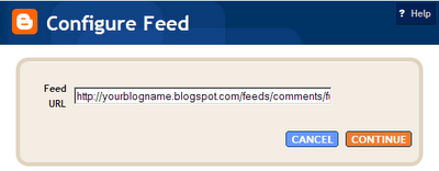
If you would like to display comments in your blog, first you must have Blogger Beta. Then go to page elements/add a page element/feed. Put this in the first box:
http://yourblogname.blogspot.com/feeds/comments/full
Make sure you replace yourblogname in the URL with your own, click continue. Then in the next window, you are able to select a few options. I named mine "Recent Chit-Chat", keep the comments to 5, and choose to have the comment author listed.

When it is done, move/drag it to the area on your sidebar you want to see it, and it is go to go!

Waiting for that first comment to show up...waiting...waiting....

post signature

Monday, 11 September 2006

Want a sidebar widget linking to your favorite blogs?

Do you want a little sidebar widget that will highlight posts from your favorite blogs? I figured out a way.

...Here is your chance to show your readers what you find interesting on other blogs....

Could it be a mashup? Well, maybe not, but close enough for me. You will need to open a del.icio.us account. I personally have two accounts. One exclusively for tagging posts from my blog and one for this purpose. We will be discussing the latter which I named anniebluesky. After opening your account, go either to 'Help' or 'Settings'. Then click on 'Linkrolls'. This is where you configure your widget.

  1. First box is 'show'. Default number is 15, but for my purpose I thought 5 would be better.
  2. Second box is 'title'. Default is my del.icio.us. which I left as is. I titled the sidebar section 'Blogs on Blogging'.
  3. Third box is 'show tags'. I left it blank.
  4. Fourth box is 'show notes'. Since I wanted to include part of each post, I checked it.
  5. Fifth is the 'icon' selection. Up to you what you like, if anything.
  6. Sixth is the 'bullet' selection. I liked the run of the mill bullet.
  7. Seventh is 'Sort chronologically or alphabetically'. This also is up to you, but I chose chronologically.
  8. The last 2 boxes are 'show your del.icio.us username' and show 'add me to your network' link'. I checked them both.

When you are done there, scroll up and copy the code and paste it in your template where ever you want to see it.

Next, go back to the del.icio.us to the help section. Under 'Browser' you will see 'Internet Explorer buttons' and 'Firefox extension'. Click on the browser you use and follow their instructions. This will put a little del.icio.us box and tag on your upper toolbar. They give very good instructions, along with visuals (I love visuals) so it is pretty easy to install and use.

Speaking of use. You are ready! When you are browsing and find a post you want to highlight in your blog, click on the title so the post page opens. In step #4 it enables the widget to show notes...so you highlight how much of the post you want to show in your sidebar (no need to include the title...that is put in automatically) and then click on the 'Tag' icon in your toolbar.

That is pretty much all there is to it. Since I put mine to chronologically and limited it to 5, it automatically puts the newest one to the top and removes the oldest! Spiffy.


Update: 11/08/06 I edited this a bit...removed the icons and my tag line. Slimmed and trimmed it down.

post signature

Fixing the '1 comments' bug in Blogger Beta

Once again, Hans has dissected the Blogger Beta template and found a cure for the '1 Comments' bug. If it bothers you and you would really like to have it read '1 Comment', here is how to do it.
  1. Open the Blogger editor
  2. Go to 'Edit HTML'
  3. Expand Widgets Template
  4. Find:
    <b:if cond='data:post.allowComments'>
    <a class='comment-link' expr:href='data:post.addCommentUrl' expr:onclick='data:post.addCommentOnclick'>
    <b:if cond='data:post.numComments == 1'>1 <data:top.commentLabel/>
    <b:else/>
    <data:post.numComments/> <data:top.commentLabelPlural/>
    </b:if>
    </a>
    </b:if>
  5. Remove :<data:top.commentLabel/>
  6. Replace with: comment

Thanks (again) Hans!


post signature

Saturday, 9 September 2006

Improving the Label/Archive Pages with Peek-a-boo View

Ramani over at Hacksphere is at it again. This time he outlines how to improve the Label/Archive pages in his post: Peek-A-Boo view of posts in Label/Archive pages . The default action when a label/category is selected is a new page with all the the posts in their entirety. This hack implements a method for readers to expand/collapse a post title after clicking a Label on the main page. Try it by clicking on a label in my 'Category Cloud'. Much easier navigation!

I feel Ramani has given good instructions, so I won't go into the specifics. I will warn you...when the widgets are expanded, they can be hard to follow. Just be slow and precise, follow his instructions, and all will go well.

Before starting, be sure to save your template. Then start editing. If you have a problem, let me know and I will try to help.

post signature

Thursday, 7 September 2006

My Category Cloud...finally

I have wanted a true category cloud ever since I started blogging, and discovered the whimsical category cloud. What is not to love? All my words...floating around...different colors...different sizes.

Now with the coming of Blogger Beta are "Labels". Nice. Not perfect...yet. But, none the less, nice. I still wanted my cloud.

Then I found Code for Beta Blogger Label Cloud which has forever changed the face of my blog.

I actually have my cloud, and when a category is clicked, a page from my blog opens up with all the posts related to that category. Just as it should be. phydeaux3 has give simple complete, easy to follow instructions that produce a functioning label cloud. And he tells you how to modify the code to change the colors and font.

Thanks, phydeaux3!!

Update 9/8/06: If you are like me, and have special colors that aren't on the RGB Color Code Chart, I found a Hex-RGB Color Converter that will convert your lovely hexidecimal colors to RGB.

post signature

Blogger Beta - Labels

Little things make me crazy. One of those little things was the 'Labels' at the end of my posts. I wanted them to start on a new line all to themselves. At first I thought I was doomed to have willy-nilly label lines that did whatever they had a mind to. But, not so! On a whim, I went into the 'Page Element' editor and opened 'Blog Posts'. In the box that you put what you want to call your labels, I added this:
<br>Labels
That was all it took. Another little thing conquered!

post signature

Get your own ClusterMap

I've been asked to do a little tutorial on installing a ClusterMap on a blog. Well, the good news is...it is simple to install. The bad news...there is a pause in new registrations until the first part of September 2006.

To install after they start accepting new registrations, click on the above ClusterMap URL, click on 'Get One'. It has been awhile since I did it, but I think I went through a registration process (my username, password, blog address...the normal information), then I was given a code to put in my template.

On my blog, it is in the first sidebar. I installed it in the 'Page Elements' section, 'Add a Page Element'. At this point you can either choose a text or HTML/Javascript element. (I used text.) Click on 'Add to Blog'. Then click on 'Edit HTML'. Paste your code there. Put a title on if you wish. Click 'Save Changes' and you are done!

post signature

Tuesday, 5 September 2006

Sticky Message Board

Hans posted a wonderful tutorial on adding a little sticky message board to the top of your blog. It was extremely easy to follow, and I had it up and running within minutes. I made a few modifications so it would blend with my blog. Here is what I did.

First to the "/* Variable definitions" I added this:
<Variable name="bgMsgBrd" description="Messageboard Background Color" type="color" default="#EFEFF7" value="#EFEFF7">
<Variable name="bordercolor" description="Messageboard Border Color"
type="color" default="#336699" value="#336699">
<Variable name="colMsgBrd" description="Messageboard Text Color"
type="color" default="#555555" value="#555555">
Second to the CSS style sheet I added this with the modification for my fluid template:
/* Messageboard */

.msgbrd h2 {
display: none;
}

.msgbrd .widget-content {
width: 99%;
background-color: $bgMsgBrd;
border: 1px dotted $bordercolor;
color: $colMsgBrd;
font: $bodyfont;
}
Third, to the template I added:
<div id='content-wrapper'>
<div id='message-board'>
<b:section class='msgbrd' id='msgbrd' maxwidgets='1' showaddelement='yes'/>
</div>
Last I opened the Layout Editor and under the header was a new element. I clicked 'Add a Page Element' , and selected 'Text'. All that was left to do was type my message.

Thanks, Hans!!

post signature

Monday, 4 September 2006

Blogger Beta - all moved in (or Widgets are wiley)

It is a done deal. I moved in officially to Blogger Beta. Not too bad. A few casualties...all widget connected. I'm still working out the bugs. It appears only one script per widget. I would really enjoy having at least two scripts in a widget. For example, I edited my Technorati widget in the previous Blogger to have a link for del.icio.us also. (You know...add me to blah blah.) It was all nice and neat in one area on my sidebar. I can't get both links/scripts into one widget. I'm working on that one. And I'm picky about my sidebars so I just removed the del.icio.us link for now.

Another example. My 'Creative Commons' button. With the old Blogger I was able to have '2006 ANNIEBLUESKY' centered nicely under the CC button. For the life of me, I couldn't get it to center in the Beta widget. So I removed it, and made a hoover pop-up. Not solved exactly...a work-a-round.

Other than that, it went pretty well. I did it slowly in a practice blog, and copied all of Blog U to it. Piece by piece. Working from the top down. When I had it all in, and it looked like the orginal blog, I downloaded the template to my harddrive then uploaded it to Blog U. (whew)

I haven't even addressed the 'Labels' yet. Guess I'll stick a few on this post and see what happens!

post signature

Saturday, 2 September 2006

Blogger Beta - Fluid 3 column template

I'm forging ahead with Blogger Beta experiments. I put in three columns...fluid no less! Once again, thanks to my expertise and incredible knowledge of coding Hans and his post Adding a Second Sidebar to Your Template.

Here are the steps I took:
  1. I read Hans post :-)
  2. I removed the #sidebar-wrapper
  3. I added a #leftsidebar-wrapper and a #rightsidebar-wrapper
  4. I made these changes to the #outer-wrapper, #main-wrapper, #leftsidebar-wrapper and #rightsidebar-wrapper
    #outer-wrapper {
    margin-left: 5%;
    margin-right: 2%;
    width: 93%;
    padding:0px;
    text-align:left;
    font: $bodyfont;
    }
    #main-wrapper {
    width: 50%;
    float: right;
    word-wrap: break-word; /* fix for long text breaking sidebar float in IE */
    }
    #leftsidebar-wrapper {
    width: 22%;
    float: left;
    word-wrap: break-word; /* fix for long text breaking sidebar float in IE */
    }
    #rightsidebar-wrapper {
    width: 22%;
    float: left;
    margin:0 0 0 25px;
    word-wrap: break-word; /* fix for long text breaking sidebar float in IE */
    }
I'm no more surprised than you. Just a few more tweaks here and there, and I believe I may be ready to switch this blog over to Beta completely!

post signature

Blogger Beta - adding a header

Hans was kind enough to leave a comment on Blogger Beta - First experience with editing HTML as to a cleaner way to get my header to show as I want. Here is part of his comment (bold is my editing):
Hi Annie, good to see a fellow-blogger exploring this unknown territory. I guess your approach to replacing your title is quite good. It looks good at your testblog, so it works like it should.

I have a few suggestions for the coding:

You could remove the border-statement from your header-wrapper, instead of setting it to 0px;
If there are no other calls to the $bordercolor-variable, you can remove this variable from the css; this will remove it from the fonts&colors layout editor as well.

You have made the title invisible by setting its color to white and its size to 0 (is that correct?).
You could instead insert the code
display: none; in the css-part of header h1.

I did it, and it works! I suppose there are other ways to accomplish the same thing, but I like this. It is clean and simple. Thanks, Hans!

post signature

Blogger Beta - First experience with editing HTML

I decided to create a practice blog to...well...practice on. Turns out to be one of my better moves. Initially I thought I would be clever and simply paste my old template into the new 'Edit HTML' area. Turns out not to be one of my better moves. The red error messages flew at me fast and furious. Not to be defeated, I changed my strategy. I retreated back to their template, Minima.

I found the new template code to be different and contained things I have no idea what they are or do. Even after reading the instruction manual. *sigh* I'm sure an understanding will come at some point in time. At least I hope so. Until then I will do what I can which relies heavily on trial and error. The good part about my method, is I learn as I go. My new plan was to take this template and make it look like my orginal one with the added widgets and labels that I want to incorporate into my blog. The best of two worlds. Plan of attack...start at the top and work my way down. The header it was.

I wanted to replace the header with mine as I have it in my orginal blog. So, without further ado, this is what I did:
Change:
#header {
margin: 5px;
border: 1px solid $bordercolor;
text-align: center;
color:$pagetitlecolor;

To:
#header {
width:660px;
height:161px;
margin:0 auto 10px;
background: #fff url
(http://YOUR HEADER IMAGE URL HERE) no-repeat;
}

----------

Change:
#header-wrapper {
width:660px;
margin:0 auto 10px;
border:1px solid $bordercolor;
}

To:
#header-wrapper {
width:660px;
margin:0 auto 10px;
border:0px solid $bordercolor;
}

----------

Change:
#header h1 {
margin:5px 5px 0;
padding:15px 20px .25em;
line-height:1.2em;
text-transform:uppercase;
letter-spacing:.2em;
font: $pagetitlefont;
}

To:
#header h1 {
margin:5px 5px 0;
padding:15px 20px .25em;
line-height:1.2em;
text-transform:uppercase;
letter-spacing:.2em;
font: $pagetitlefont;
color: white;
font-size:0%;
}
Victory was mine! I was able to replace the header with my own, remove the border and make the Blogger title 'invisible'. Now, I'm not claiming my method is proper coding. I realize that those of you with much more knowledge in these areas will look at what I have done and shudder. But, it worked for me.
I'm already thinking about what to tackle next!

Update: see Blogger Beta - adding a header

post signature

Thursday, 31 August 2006

Edit HTML for templates in Blogger Beta released

It is here! Big excitement!! You can now edit your new Blogger Beta template. I have just found out and am researching it. At first glance it seems things are a little different. Just scanning the documentation, the new template language is completely different from the original one. There is much talk about widgets and sections...oh my.

So, above all, save your template before doing anything. Another way to experiment without damaging your orginal template beyond repair is to open an experimental blog and paste your template in. Go from there.

Here are a few links to get you started:


post signature

Make your own offical seal


I don't know why, but anytime I can make something...a button, logo, seal, header...it makes me happy. Here is my newest find the Official Seal Generator. Much happiness!!! It was pretty large, so I resized it to half the orginal size. Pretty nifty.

post signature

Wednesday, 30 August 2006

Fluid 3 column Blogger template

I was inspired to the point of acting on it. The post by George Mikos made me realize that I wanted had to have a fluid CSS template. The thought of my blog expanding to fit each and every reader's computer display was very tempting. So, throwing caution to the wind, I jumped in.

It was relatively simple. Realizing the sum total must be 100% and I had three columns...two sidebars and the main content...I did some simple math. I first addressed the entire content:
  • left margin 5%
  • right margin 2%
  • width 93% (this 93% contains the main and two sidebars)
I then assigned these values: (Follow me here. This is 100% of the above 93%)
  • main 50%
  • sidebarleft 22%
  • sidebarright 22%
  • 6% for the space between the columns

To actually edit the template, I located #content, #main, #sidebarleft and #sidebarright in my style sheet. In each one of those I edited the width property by removing the px value and replacing it with the % value. For example:
#main {
width:410px;
float:right;
}

changed to:

#main {
width: 50%;
float:right;
}
I tried different percentage amounts for the sidebars and main, until I found what I liked.

There is controversy over fixed vs fluid design. I had fixed and was never really happy with the way it displayed on different displays. I like the fact that now my page looks like it was made for each and every display. No large expanse of unused whitespace. I know...I like whitespace as much as the next person. It is striking when it is part of the design. Not when it is only there because of the limitations of a fixed template source.

Then there are schools of thought on the optimum line length for ease of reading. Some say 12-15 words are best or 55 characters. Others say longer lines are better. For me, I don't think it will be such an issue because I have three columns. But, I do have another little trick in mind, and I will write about it when I get it working!

So, let me know what you think. What computer display you use, and how do you like it? Any suggestions?

post signature

Monday, 28 August 2006

Customizable blogger template

Yes, artistic standards. The source should look pretty. Although authoring HTML and CSS is a decidedly left-brained, analytic activity, the right brain's capacity for gestalt can play a valuable role.RealityTopia

This article at RealityTopia Blog gets into the inner workings of a template. George Mikos wrote his own template source out of a need for an easily customizable Blogger template. He not only shows you the how, he explains why. I am able to learn much easier if I know the reason behind doing something, and he certainly provides that. The article is easy to read and interesting. Much like his template source which he takes great pride in. And he should.

I fully intend to study his methods more. I am interested in it all, but especially in the use of the CSS float property to dynamically access the entire width of a computer display screen, be it 1024 x 768 or 800 x 600.

There is much to digest in his post. I highly recommend looking it over if you have any interest in building your own template.

post signature

Tuesday, 22 August 2006

LibraryThing widget for your blog

LibraryThing allows you to put your book titles online. You can enter 200 titles for free. For an unlimited amount of books, it is $10 for a year and $25 lifetime membership. Joining is extremely simple...no first name, last name, secret question, email address, repeat email address, jumping through hoops. Adding books to your collection is as easy as joining. Just type in the title or author. A selection will come up and you click a title. After joining and adding some books, you are able to see who shares the same books. There is an active forum for discussing books and anything else you want to get off your chest.

If you want to share your collection in your blog sidebar, a widget is offered. You can configure it as you like.

Here is my little widget.


post signature

Friday, 18 August 2006

Customizing your header - Web2.0 Logo Creator

Here is another little fun thing I came across...Web2.0 Logo Creator It was meant to be a paradoy of Web2 Logos. But, it is still eye catching. I had entirely too much fun with it.

post signature

1 easy step to improve search box design

I stumbled upon a great little bit of code called Beautiful Form. It was written for Stylist, a program that is to CSS what Greasemonkey is to javascript. (So, it doesn't show up in Internet Explorer.) I liked it so much and wanted it to be incorporated into BlogU. So, I copied the code, made a few changes so it would blend with my blog and put it in the stylesheet. Here is what the search box looked like before and after:


Here is the code that I used:
@-moz-document url-prefix(http) {
/* change the buttons*/
input[type="reset"], input[type="submit"], button
{
-moz-border-radius: 0.5em !important;
border: 1px solid #CCC !important;
border-bottom: 1px solid #CCC !important;
background-color: #EEE !important;
color: #555555 !important;
}
input, textarea
{
-moz-border-radius: 0.8em !important;
}
input, textarea,select
{
background-color: #FFF !important;
border-top: 1px solid #C3C3C3 !important;
border-right: 1px solid #C3C3C3 !important;
border-bottom: 1px solid #C3C3C3 !important;
border-left: 1px solid #C3C3C3 !important;
color: #555555 !important;
}
/*change them on focus with a blue border*/
input:not([type="button"]):not([type="reset"])
:not([type="submit"]):not([type="checkbox"])
:focus,textarea:focus
{
-moz-outline-radius: 0.8em !important;
}
input:not([type="button"]):not([type="reset"])
:not([type="submit"]):not([type="checkbox"])
:focus, textarea:focus, select:focus
{
-moz-outline: 2px solid #ccc !important;
-moz-outline-offset: -1px !important;
}
/*rollover effect on the buttons*/
input[type="submit"]:hover,input[type="reset"]
:hover,button:hover {
border-color: #E8E9E8 !important;
border-bottom-color:#E8E9E8 !important;
background-color: #FCFCFC !important;
}
}
If you prefer to start with the orginal code, you can find it at userstyles.org.

post signature

Wednesday, 16 August 2006

I Did the Blogger Beta Switch

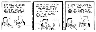
The feeling of impending doom was over-powering, but I simply could not help myself. I was extremely scared hesitant to do the switch, but after extensive research I felt reasonably safe in switching. Not many of you know this, but I have this...well, let's call it a condition. Dilbert has the same condition.

A few concerns I had:
  1. Will my template that I have tweaked and hacked survive the move?
  2. Will I be able to edit the template as before?
  3. Will my URL be changed?
All of these concerns, plus concerns I didn't even realize I should be worried about, were answered over at FreshBlog by Pete and John.

The switch went smoothly, especially since I already had a Gmail account. I know there are some bloggers that have to wait. What made me so special, I have no clue. But, I'm feeling rather superior none-the-less. (They probably drew my name out of a hat.) Anyway, after I got over myself, I got down to business. I logged in and they sent me an email when the 'migration' was complete. Finally I was able to log in and see exactly what was left of my blog. Much to my suprise, it was intact. (Things like that never happen to me. Usually after some big upgrade, I end up having to reformat my computer.) I stuck with the 'edit html' option and shyed away from 'customize design', as tempting as it was. In doing so, I am unable at this time to do anything with many of their new features. But, I suspect it will be coming, as they said the new beta is not complete.

I did get a fancy new navbar that makes working on your blog a click away. And, publishing the blog is a breeze now...no more waiting...waiting...waiting. It is instant! Plus I noticed that on the 'edit posts' page, it shows how many comments you have for each post. Nice. Another new option is a private setting for those of you with deep dark secrets!

The catagory (aka Blogger labels) thing I'm not too sure about yet. I like using FreshTags and having all my catagories picked up by del.icio.us and Technorati. But, I think it will be fun playing with all the new features when they become available to those of us that are not planning to go with the cookie-cutter, plug & go customized templates. Not that it is bad, it just isn't my cup of tea.

All in all, a great upgrade. I'm happy to know they haven't forgotten us.


post signature

Saturday, 12 August 2006

Keep track of Comments/Conversations with coComment

...see when people have added other comments to the discussion...

One of the perks of blogging is the easy interaction between the participants. Comments are the backbone of blogging. With the use of comments a blogger is able to get feedback, answer questions and get to know his/her readers on a more personal level. But, with all the blogs out there and all of the comments, it becomes quickly difficult to remember where you left a comment.

coComment to the rescue! I first found out about this from Blog-Blond. coComment was exactly what I've been looking for.

Previously I would comment on a post and think I would never forget where that blog was. Guess what? I did forget. Time and time again. But, those days are long gone. They couldn't of made it any easier. One less thing on my mind. I would highly recommend giving coComment a try. You won't be sorry.

post signature

Thursday, 20 July 2006

Categorized recently updated blogroll links

Recently I've added a new feature to my blog. It is a blogroll for each of my 'link categories' in the sidebars. I had two criteria that needed to be met. Those being an easy way to add links and a way to indicate if they were recently updated.

It was a bit of a process to set up initally, but now it is a breeze to keep up. I used BlogRolling because they had the update feature. The downfall (only a downfall because I'm cheap) is the fact that with the free account you can only have one blogroll. The 'Gold' edition allows several blogrolls. I needed six, so my work-around was to open six gmail accounts (ie blogu.tweaks@gmail.com, blogu.templates@gmail.com, etc) . Then I opened six corresponding blogroll accounts (ie blogu.tweaks, blogu.templates, etc). Each of those matched a heading in my sidebar. Take a look at my sidebar to see it in action.

As far as upkeep, BlogRolling has a feature called 1 Click Blogrolling that puts a link in your Bookmarks or Links Toolbar. Click on that when you find a blog you wish to add to your blogroll. After you click on it, log in to the 'account/sidebar category' that you want the link to appear. That's it! Nifty, huh.

post signature

Sunday, 16 July 2006

FlickrFont

Using Flickr you can change fonts into a graphical graffiti extravaganza. Use it to design a different header or spice up a sidebar. It can be static or dynamic. But use it with discretion...it could become a visual nightmare! It is a little strange, in a 'crazed serial stalker' sort of way. But, none-the-less, it is interesting.

Here is a sample:

BLOG U

You can get your very own at FlickrFont if you have the inclination for the bizarre. Read more about it at Fresh FlickrFont From Feeds.

post signature

Wednesday, 12 July 2006

Freshtags - interactive and context sensitive tag / category menus

...This way, readers are more likely to see what they want and so stay on your site....From the Fresh Tags Main Page

I am using a new method for categories that I found called FreshTags v. 0.5 - Freshblog. It uses, del.icio.us, but it is not completely necessary for you to have an account.

One the features that I like the most is tag-grabbing. It scans your viewer's previous page for keywords that match your tags, or categories. For instance, if you do a search for "Blog U CSS/HTML" then click on the link, my blog will reflect this by making the 'CSS/HTML' category bold and displaying a list of all my posts related to that category. Pretty awesome! I'm still learning about what all FreshTags is capable of.

The FreshTags site has more detailed information. When you visit, play around in the 'Build' area to make your tags the way you like for your blog. It is simple to implement on your blog. There are three sections of code that your paste into your template, then you are done! Set back and watch the magic!

post signature

Two sidebars in blogger - Part 2

It was brought to my attention that I left out a bit of information needed to make the two sidebars work. If you haven't read Two sidebars in blogger - Part 1, read it first. The part that slipped my attention is buried deeper in the template. You have a section of code that should read:
<div id="sidebarleft"><div id="sidebar2">
Simply add this after all the content in your left sidebar:
<div id="sidebarright"><div id="sidebar2">

Be sure to add a matching </div> for each <div> that is added (that would be two for each sidebar) to close the tags.These are placed at the end of your sidebar code. Otherwise things will get crazy fast. Now you add content to that sidebar as you have before (ie where you want the content to be seen in your blog). Sorry I didn't notice that omission before.

With all that being said, it seems each blog has it's own idea of how it will allow another sidebar to be introduced into the mix. When I added the second sidebar to by blog, it was very simple...cut and paste and it was a done deal. I recently helped a friend add a second sidebar to his blog. He also uses the same template as I, Minima. For some reason, it was extremely difficult. But, after a few glasses of wine and sleeping on it, I managed to make it happen. So, there is no rhyme or reason (at least to me, a person with no training) for why or why not something will work. If you are trying to add a second sidebar to your blog and it is just not happening as you had hoped, email me and I'll see if I can help. Not promising anything, but I do enjoy a challenge.

post signature

Saturday, 1 July 2006

Backup your Blogger template

Over the past few weeks I've noticed an annoying behaviour with Blogger. It seems to remove large chunks of your template. A good backup is the remedy. There are some backup programs you can use like BlogCollector or BackupMyBlog to name a few.

Another promising one is HTTrack Website Copier which I am trying out. This program is a free, offline browser utility which downloads your blog to your computer for viewing when you're not connected to the internet. It will copy all web pages, images and reconstruct internal links for offline browsing. I like the fact that you can simply update the backup on your computer.

Another method that I have been using (and will continue to use until I decide to go completely with HTTrack Website Copier) is copy and paste your template into a notepad program, date the entry and save it on your computer. That has been a lifesaver for me. There have been countless numbers of times that my blog was missing large segments of content and I reinstalled the newest backup to correct the problem. Of course, the obvious problem here is how recent is your backup? My suggestion is to do a backup after any major additions to your blog. That will insure that all your work will not be lost in a blogger glich.

While researching this, I came across a couple of interesting articles with information on backups in general, including backing up your hard-drive. An excellent article can be found at Lifehacker, Geek to Live: Automatically back up your hard drive. Ask Lifehacker Readers: Best online backup service? has information from many of their readers. Also, PC World has an article, Store It on the Web. Just remember to read the warning if you decide to go with an online storage system.

The question should not be "Will I do a backup?". The question is "How shall I implement my backup program?".

post signature