Tuesday, 4 November 2008

Classic Blogger Favicon Fix!!

I was missing my favicon on Buttermilk Clouds, which happens to be a classic blogger template. I tried several different things and nothing worked until I tried this.

In your template (towards the top) find this:
<$BlogMetaData$>
Then place the following code right after it.
<link rel="icon" href="FAVICON URL" type="favicon" />
<link rel="shortcut icon" href="FAVICON URL" type="favicon" />


If you have the new blogger template (formerly known as blogger beta) there is a fix for them, also.

Pretty easy. I really love my favicon, and I'm very upset with Blogger for attempting to do away with it. Shame, shame on you Blogger!

post signature

Thursday, 23 October 2008

Fix for Broken Favicons

I have been bombarded with emails from disgruntled bloggers that have lost their favicons. But, don't despair! There is a fix. I don't know how, or why it happened, but some of my blogs were also missing their favicon. Not all of them. But some. Once again, I don't know why. (Maybe a reader out there knows why.)

Anyway, the good news is, the fix is simple!! There are 2 steps.

Step 1 - find your favicon code in your template. It should be near the top of your template. Copy that code.

Step 2 - Paste that code here:
]]></b:skin>
PASTE ICON CODE HERE
</head>


If I have learned anything from this...we bloggers LOVE our favicons!!

post signature

Tuesday, 21 October 2008

Post Title With an Image

quotes1
First off, I love your blog! You do so many cool things with it! I was looking at some of the blogs you have done for other people. I particularily like http://christyann-photography.blogspot.com/search/label/baby. After looking at I was wondering, how did you do the image and fonts for the Post Title? I thought you did an excellent job! If you have time, I would love to know how. If not it is ok. Thanks!

--
Carrie Jo
quotes2

Pretty easy to accomplish! You must locate the .post h3 part of your CSS style sheet. Before doing anything, remember to save your template!
.post h3 {
background:url(YOUR POST IMAGE) no-repeat;
padding: 20px;
margin: 20px;
margin-top:.25em;
margin-left: 0px;
margin-bottom: 20px;
border-top:1px dashed #42c4de;
border-bottom: 1px dashed #42c4de;
padding:10 0 4px;
font: normal normal 100% Georgia, Times, serif;
font-size:240%;
font-weight:bold;
line-height:1.4em;
color: #49331c;
text-transform:uppercase;
text-align: center;
}
This is the line of code that you add to the .post h3 section.

Depending upon the size of your image (I would recommend keeping it small...around 20-30 px square.) you will adjust these values. Now, this will be different for each blog...each image. So trial and error will see you through.

If you want some sort of border, this is the code. And here are some values that you can use instead of dashed:
  1. dotted
  2. solid
  3. double
  4. groove
  5. ridge
  6. inset
  7. outset
Save your work and you have a cute little image in your post title!

post signature

Sunday, 14 September 2008

Another way to remove "Subscribe to: Posts (Atom)"

While working on a template, I was trying to remove the Subscribe to: from the bottom of the page. For some reason, previous methods that have worked for me in the past, didn't work on this template. I ended up adding this bit of code to the CSS style sheet:
.feed-links {
display:none;

}
That did it! Who knows why. Certainly I don't...I'm just happy it worked and thought I'd share.


post signature

Saturday, 13 September 2008

Related Posts

Have you ever wanted a feature under your post that shows related posts from your blog? I found this way to do it from JackBook.com. It was originally designed by Hoctro with modifications by JackBook. This uses labels/categories that you already have in place to show Related Posts by Category.

There are two steps to this hack. But before you begin, be sure to save your template!

Step 1: Go to your Dashboard | Layout | Edit HTML | check Expand Widget Templates and locate this code:
<data:post.body/>
Step 2: Place this code after the code you just located:
<b:if cond='data:blog.pageType == "item"'>
<div class='similiar'>
<!-- ***http://hoctro.blogspot.com***Jan,2007**** -->
<!-- ***Related Articles by Labels - Take Two*** -->

<!--
Modified by JackBook.Com to make it easier to use.
1. Now, users don't need to change anything to use this widget. just copy and paste, and done!
2. The current article will also be listed, now it's no more.
-->

<div class='widget-content'>
<h3>Related Posts by Categories</h3>
<div id='data2007'/><br/><br/>
<div id='hoctro'>
Widget by <u><a href='http://hoctro.blogspot.com'>Hoctro</a></u> | <u><a href='http://www.jackbook.com/' title='Related Posts on Blogger Modified by JackBook.Com. Read More?'>Jack Book</a></u>
</div>
<script type='text/javascript'>

var homeUrl3 = &quot;<data:blog.homepageUrl/>&quot;;
var maxNumberOfPostsPerLabel = 4;
var maxNumberOfLabels = 10;

maxNumberOfPostsPerLabel = 100;
maxNumberOfLabels = 3;


function listEntries10(json) {
var ul = document.createElement(&#39;ul&#39;);
var maxPosts = (json.feed.entry.length &lt;= maxNumberOfPostsPerLabel) ?
json.feed.entry.length : maxNumberOfPostsPerLabel;
for (var i = 0; i &lt; maxPosts; i++) {
var entry = json.feed.entry[i];
var alturl;

for (var k = 0; k &lt; entry.link.length; k++) {
if (entry.link[k].rel == &#39;alternate&#39;) {
alturl = entry.link[k].href;
break;
}
}
var li = document.createElement(&#39;li&#39;);
var a = document.createElement(&#39;a&#39;);
a.href = alturl;

if(a.href!=location.href) {
var txt = document.createTextNode(entry.title.$t);
a.appendChild(txt);
li.appendChild(a);
ul.appendChild(li);
}
}
for (var l = 0; l &lt; json.feed.link.length; l++) {
if (json.feed.link[l].rel == &#39;alternate&#39;) {
var raw = json.feed.link[l].href;
var label = raw.substr(homeUrl3.length+13);
var k;
for (k=0; k&lt;20; k++) label = label.replace(&quot;%20&quot;, &quot; &quot;);
var txt = document.createTextNode(label);
var h = document.createElement(&#39;b&#39;);
h.appendChild(txt);
var div1 = document.createElement(&#39;div&#39;);
div1.appendChild(h);
div1.appendChild(ul);
document.getElementById(&#39;data2007&#39;).appendChild(div1);
}
}
}
function search10(query, label) {

var script = document.createElement(&#39;script&#39;);
script.setAttribute(&#39;src&#39;, query + &#39;feeds/posts/default/-/&#39;
+ label +
&#39;?alt=json-in-script&amp;callback=listEntries10&#39;);
script.setAttribute(&#39;type&#39;, &#39;text/javascript&#39;);
document.documentElement.firstChild.appendChild(script);
}

var labelArray = new Array();
var numLabel = 0;

<b:loop values='data:posts' var='post'>
<b:loop values='data:post.labels' var='label'>
textLabel = &quot;<data:label.name/>&quot;;

var test = 0;
for (var i = 0; i &lt; labelArray.length; i++)
if (labelArray[i] == textLabel) test = 1;
if (test == 0) {
labelArray.push(textLabel);
var maxLabels = (labelArray.length &lt;= maxNumberOfLabels) ?
labelArray.length : maxNumberOfLabels;
if (numLabel &lt; maxLabels) {
search10(homeUrl3, textLabel);
numLabel++;
}
}
</b:loop>
</b:loop>
</script>
</div>

</div>
</b:if>
Save your work and all is done.

post signature

Saturday, 23 August 2008

Post Larger Images with Blogger

Have you ever wished that you could post larger images via the Blogger: Upload Images window? I found a neat trick from a reader, Miranda.

This requires a blogger template with extra width in the posting section so it will display the larger images.

Upload your image in the post window, Dashboard | Posting | Create | Add Image icon. After doing that, click on the Edit HTML tab and you will see this image code:
<a onblur="try {parent.deselectBloggerImageGracefully();} catch(e) {}" href="https://blogger.googleusercontent.com/img/b/R29vZ2xl/AVvXsEhfD95WXFoBJGXok5hUIQcZdFNzS208heTaWHIIk3WYuNPb5KC33ktW-v9WIbZsu_mNn06GyrMouRrp45I6yL-KVCTaDbSTkEUWGnu2gbjubwDocmeFyC3t58a9zq_hkpsPkjZa12z1pfv4/s1600-h/DSC_2693.JPG"><img style="margin: 0px auto 10px; display: block; text-align: center; cursor: pointer;" src="https://blogger.googleusercontent.com/img/b/R29vZ2xl/AVvXsEhfD95WXFoBJGXok5hUIQcZdFNzS208heTaWHIIk3WYuNPb5KC33ktW-v9WIbZsu_mNn06GyrMouRrp45I6yL-KVCTaDbSTkEUWGnu2gbjubwDocmeFyC3t58a9zq_hkpsPkjZa12z1pfv4/s400/DSC_2693.JPG" alt="" id="BLOGGER_PHOTO_ID_5237868380194789154" border="0" /></a>
All you change is the s400 to s800! Then you have a nice large image on your blog.

I'm not sure how legal this is. All I know is that it works.

EDIT: Question was brought up about draft users. I didn't realize the image code was different, but it is. So, if you use Blogger in Draft, here is your instructions. Follow the directions above. You will see this image code:
<a href="https://blogger.googleusercontent.com/img/b/R29vZ2xl/AVvXsEhA0xM0T2ufp5aJb1Qds4Awt07xPmbWWNY_2glvdgwg6BVaw5Opm7BZaGuSd-VRW3kK5oQ9Fhv720kgSl82lV9Xx7FZa0gfuDITsQ3F1kpqv7wDBq7iOT3JwNtEdSt075iLEpCOT9qfS06v/s1600-h/DSC_2689.JPG" imageanchor="1" style="margin-left: 1em; margin-right: 1em;"><img border="0" src="http://2.bp.blogspot.com/_OFh1WWXWCHM/SLDBAvBlhrI/AAAAAAAAB7g/kTUthEX2IYc/s320-R/DSC_2689.JPG" /></a></div>
Change this s320-R to this s800-R. Where there's a will, there's a way!

EDIT 09/08/08: Thanks to The A of DNA for: If you don't want it as large as s800 replace it with s576!

post signature

Friday, 22 August 2008

Blogger Error Messages

Oh. You know them. You've seen them. The nasty red font above your template edit window after you attempt to save your template or even preview your work. Jeering at you with:

Your template could not be parsed as it is not well-formed. Please make sure all XML elements are closed properly. XML error message: Element type "href" must be followed by either attribute specifications, ">" or "/>"

or

More than one widget was found with id: HTML3. Widget IDs should be unique.


Makes my skin crawl. But, you can battle the error message...and be victorious!!

I think the two examples above are probably the most commonly seen messages. At least for me they are. The first example can have a variety of elements in the "href" spot. Sometimes it is like fill in the blank. But, the thing to focus on is the ">" or "/>". I noticed, while working on a template yesterday for Pauls Health Blog, that I kept getting this error...with "div" as the element. It said that a "div" element wasn't closed properly. I checked and checked. Nothing looked out of place. But, the code I put in had "/>" at the end of it. And where I put the code, it already had the closing tag a bit further down. Finally I spied that little "/". That was the culprit. I removed the "/" and was finally able to save the template.

Lesson here is if you get this message, look carefully at the exact code you just put in. Does it have the "/" at the end with the ">"? If so, remove it. Or, controversially, if you get the error and it doesn't have the "/" at the end, slip it in!

The second error message comes up when adding code to your template that has already named the widget. It is easy to fix. Find the culprit in question and renumber it. It doesn't make any difference what number, just as long as it doesn't occur anywhere else in your template. It wants to be unique.

post signature

Wednesday, 13 August 2008

+/- (hide/show, expand/collapse) Labels

I'm on a label enhancement mission. Maybe my drop down menu label method didn't do it for you. Good news! Here is another option for you label makers using the infamous +/- method. This is simple, simple, simple.

Step 1 - Without expanding your widgets, find this code in your template:
<b:widget id='Label1' locked='false' title='Labels' type='Label'>
Step 2 - Replace that line with this code:
<b:widget id='Label2' locked='false' title='Labels and Feeds' type='Label'>
<b:includable id='main'>
<script type='text/javascript'>
//<![CDATA[
if(typeof(rnd) == 'undefined') var rnd = '';
rnd = Math.floor(Math.random()*1000);
rnd = 'id-' + rnd;
document.write('<a href="#" onclick="tmp = document.getElementById(&quot;' + rnd + '&quot;); tmp.style.display = (tmp.style.display == &quot;none&quot;) ? &quot;block&quot; : &quot;none&quot;; return false;" style="float:left;margin-right:5px;">');
//]]>
</script>[+/-]
<script type='text/javascript'>
//<![CDATA[
document.write('<\/a>');
//]]>
</script>
<b:if cond='data:title'>
<h2><data:title/></h2>
</b:if>
<div class='widget-content'>
<script type='text/javascript'>
//<![CDATA[
document.write('<div id="' + rnd + '" style="display:none;">');
//]]>
</script>

<ul>
<b:loop values='data:labels' var='label'>
<li>


<b:if cond='data:blog.url == data:label.url'>
<data:label.name/>
<b:else/>
<a expr:href='data:label.url'><data:label.name/></a>
</b:if>
</li>
</b:loop>
</ul>

<script type='text/javascript'>
//<![CDATA[
document.write('<\/div>');
//]]>
</script>
<b:include name='quickedit'/>
</div>
</b:includable>
</b:widget>
TaDa! Label those posts!

EDIT: 08/16/08 - In order for this to work, you have to have a label widget in place. And you have to have posts labeled. So, go to your dashboard | layout | page elements | add a gadget | Labels before trying this code.

post signature

Tuesday, 12 August 2008

Drop Down Menu for Labels

quotes1
Hi Annie
I've just successfully used your instructions on adding tabs to my blog and have seriously cleaned up my sidebar, for which I sincerely thank you but, I would like to go a bit further. My Label list is pretty long and I would like to have a scroll bar or drop down menu for it. Trouble is, I can't see how I can get the scroll bar instructions on BlogU to work with the Label page element 'cos there's nowhere to enter the code given and I can't find anything about a drop-down (unless I've passed over it) on your blog.
Just thought it was worth an email to ask advice and to say thank you for the info I've already used successfully. I've recommended your site to a friend and put a link on my blog list ....
quotes2

My readers are keeping me on my toes! Here is another request...this time for a drop down menu for labels. Here are the steps to accomplish this.

Step 1 - find this code in your template:
<b:widget id='Label1' locked='false' title='Labels' type='Label'>
Step 2 - replace that line with this:
<b:widget id='Label1' locked='false' title='Labels' type='Label'>
<b:includable id='main'>
<b:if cond='data:title'>
<h2><data:title/></h2>
</b:if>
<div class='widget-content'>
<br/>

<select onchange='location=this.options[this.selectedIndex].value;' style='width:200px'>
<option>Labels</option>
<b:loop values='data:labels' var='label'>
<option expr:value='data:label.url'><data:label.name/>
</option>
</b:loop>
</select>

<b:include name='quickedit'/>
</div>
</b:includable>
</b:widget>
There are a few places in this code to customize it. Change this number to change the width of the box to fit in your sidebar. Change the wording that shows in the first line of your drop down box...to whatever you like.

Now you have a sweet little drop down menu to corral those labels that are getting out of hand. Go now and label with reckless abandon!!!

EDIT: 08/16/08 - In order for this to work, you have to have a label widget in place. And you have to have posts labeled. So, go to your dashboard | layout | page elements | add a gadget | Labels before trying this code.

EDIT: 08/21/08 - If you want to display the label count {trees (5) birds (9) flowers (3)} after each label use this code in Step 2:
<b:widget id='Label1' locked='false' title='Labels' type='Label'>
<b:includable id='main'>
<b:if cond='data:title'>
<h2><data:title/></h2>
</b:if>
<div class='widget-content'>
<br/>

<select onchange='location=this.options[this.selectedIndex].value;' style='width:200px'>
<option>Labels</option>
<b:loop values='data:labels' var='label'>
<option expr:value='data:label.url'><data:label.name/>
(<data:label.count/>)
</option>
</b:loop>
</select>

<b:include name='quickedit'/>
</div>
</b:includable>
</b:widget>
EDIT 09/07/08: Here is an example of the drop down box before expanded and after:


post signature

Monday, 11 August 2008

HTML Code Box

quotes1
Hi,
I did a Google search on how to put a box with html code to "grab a button" in a blog post or somewhere else on the blog and yours came up.
I see that you have just what I am looking for close to the bottom of your blog (under the posts).
I have a button and all I need to do is put the code into a box so that people can copy and paste it to put the button on their blog. How can I add the same thing to my blog?
Your help would be very much appreciated.
Regards,
Gerri
quotes2

Occasionally you want your readers to be able to copy code. Just how to get that code on your blog with out it doing it's little html magic first? Put it in a little box like this:
I'm a visual person, so the best way for me to explain this is with the exact code that I used for the above box:
<center>Grab this button:</center><center><img style="border: 0px none ;" alt="BlogU Button link" src="http://farm4.static.flickr.com/3092/2505649265_9cb03e574d_o.png" title="Steal my button!" width="80" height="15" /></center>
<center><textarea id="code-source" rows="3" cols="28" name="code-source"><a href="http://bloggeruniversity.blogspot.com/"><img border="0" src="http://farm4.static.flickr.com/3092/2505649265_9cb03e574d_o.png" /></a></textarea></center>
And here is the code showing what you need to change:
<center>TEXT EXPLAINING WHAT IS IN BOX</center><center><img style="border: 0px none ;" alt="LINK TITLE" src="IMAGE URL" title="LINK TOOLTIP TITLE" width="XX" height="XX" /></center>
<center><textarea id="code-source" rows="3" cols="28" name="code-source"><a href="LINK"><img border="0" src="IMAGE URL" /></a></textarea></center>
The pink code is where you can adjust the size of the box. All that is left to do is place it in a HTML/Javascript widget!

post signature

Sunday, 27 July 2008

Using an Image as the Sidebar Title

I love the effect of that an image gives as the sidebar title. It is such a simple thing to do. First things first. You will need a suitable image
Title image
that you can change the font on. My suggestion would be to make one using GIMP. This may help: Tutorial: custom header for Blogger using GIMP. Save your original (fontless) image as a template for changes you may make down the line to your sidebar. Look. I made one for Links!

OK. We have an image or two ready to go. My title image is for links, so I will show you how to do a widget for links. Open your Dashboard | Layout | Page Elements | Add a page element | HTML/Javascript. Add the following code to the window:
<img src="TITLE IMAGE URL"/>

<a href="LINK URL" target="_blank">LINK TITLE</a><br/>
You can add as many links as you want by opening (edit) the widget and adding this code:
<a href="LINK URL" target="_blank">LINK TITLE</a><br/>
for each new link. It certainly is a fun way to dress up your sidebar and coordinate it with other design elements in your blog.


post signature

Saturday, 12 July 2008

Scroll Box

quotes1
...What I would like is a place to put widgets, links, webrings, etc in a
box which shows a little of the content and then can be scrolled down
to see the rest. Just like the thing on my site from Technorati, but I
want to add my own content, not just links...
quotes2
Laura wanted a way to organize her sidebar...something more than the now famous Hide/Show hack. What she wanted was the classic scroll box.

Here is how you do just that. Open your Dashboard | Layout | Add a Page Element | HTML/Javascript. Add this code in the window:
<div style="border: 1px solid #000000;background-color:#ffffff; width:200px; height:250px; overflow:auto; color:#555555;"><p> ADD TEXT OR CODE SCRIPT HERE
</p>
You will adjust these bits of code for width and height. Each blog will be different, so play with the numbers until the scroll box fits in the area you want. You will add the code you want displayed here...be it javascript or plain text. You may want to put a <br/> or two between lines of code to separate the items.

If you use a Classic Blogger template, instead of putting the code in a widget, you will put it in your sidebar area amongst the other items that live in your sidebar.

So, go ahead! Gather up all your little do-dads and put them safely in the scroll box and be happy. Have a cup of coffee and admire your work!

post signature

Sunday, 29 June 2008

Inline Comments for Blogger!!!

Oh, happy days!! Blogger, in it's infinite wisdom, has decided to give us inline comments!!! I have waited and waited. Tried hack after hack, but couldn't get any to work. Now it is there for the clicking!

If you have a straightforward template the change is extremely simple. You must got to the Blogger in Draft dashboard. Go to Settings | Comments | Comment Form Placement. Then select Embedded below post. Save and that is it.

For those of us that have done extensive customization to the template, there are a few more steps. First, follow the above instructions. Then do a quick check on a post page and see if the inline comment form is in place. If not, this is what I had to do to my template. Remember each template is different, and it may take some trial and error. Save your template before beginning.Go to your Dashboard | Layout | Edit HTML | Expand Widget Templates. The key word I looked for to get me where I needed was comment-footer.

Side note: did you know that in Firefox you can go to Edit | Find in This Page... That will open a little bar at the bottom of the window. Type in the word you want to search for. In this instance, I typed in comment-footer. Then click next. Each time you click it, you will be taken to the next instance of that word or phrase in the page!!

Find:

<p class='comment-footer'> <a expr:href='data:post.addCommentUrl' expr:onclick='data:post.addCommentOnclick'>Post a Comment</a> </p>

Change to:

<p class='comment-footer'><b:if cond='data:post.embedCommentForm'> <b:include data='post' name='comment-form'/> <b:else/><a expr:href='data:post.addCommentUrl' expr:onclick='data:post.addCommentOnclick'>Post a Comment</a></b:if> </p>

Your template may be tweaked differently. Basically, this is the line of code I had to add which made the inline comment form appear:

<b:if cond='data:post.embedCommentForm'> <b:include data='post' name='comment-form'/> <b:else/></b:if>

Now commenting has been taken to a whole new level on BlogU and blogs across the world! It is quick and simple for readers to leave a comment without leaving the page.

post signature

Wednesday, 18 June 2008

Firefox 3 has arrived!

Firefox 3


It is official...the brand new, better than ever, much awaited Firefox 3 is ready for download!!!! And they are attempting to set a new Guinness World Record. So, do your part and download. The world would be a better place. At the very least, I would never have to code for that klunker of a browser, Internet Explorer, ever again!!!!

When you show your support and download the FF3, you will get a cute little badge. Wear with pride.


post signature

Monday, 9 June 2008

Expand/Collapse Sidebar Widget Title

quotes1
Hi Annie
First I want to thank you for all this info. I spent about three days wondering how to expand/collapse my labels before I stumbled on your blog.

I have a slight problem though.
When I use the title part of the page element, I get a nice big title but it's not collapsable. If I use your code, the collapsable link appears in small text and isn't very visible.

I've put the examples up on my blog - which is at ReviewInk on blogspot.com

The first is your label code.

As you can see, the part entitled "Look at me, I'm collapsable" isn't in fact collapsable.
The collapsable link is actually the one underneath it that reads "Reviews By Author - small collapsable link.

The other part is the regular label listing under "Reviews - By Author" which is what I'd like the collapsable menu to look like.

Hopefully this is making some kind of sense, and I'd be really grateful for your help.
Thanks so much!
Amy
quotes2

If I'm understanding correctly, you want a +/- sidebar title like my Blogging Tools area in my sidebar.
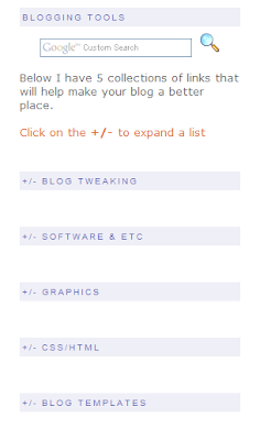


Each of the five titles marked +/- will expand a list of links. Note - to make it easier, do not expand the widgets templates. Scroll down to your sidebar wrapper. This is how mine looks:

Click for a larger view


Find the CSS style sheet. You will place the following code between the <b:section>and the </b:section>:
<b:widget id='LinkListXX' locked='false' title='+/- YOUR TITLE' type='LinkList'>
<b:includable id='main'>
<script type='text/javascript'>
//<![CDATA[
if(typeof(rnd) == 'undefined') var rnd = '';
rnd = Math.floor(Math.random()*1000);
rnd = 'id-' + rnd;
document.write('<a href="#" onclick="tmp = document.getElementById(&quot;' + rnd + '&quot;); tmp.style.display = (tmp.style.display == &quot;none&quot;) ? &quot;block&quot; : &quot;none&quot;; return false;">');
//]]>
</script>
<b:if cond='data:title'><h2><data:title/></h2></b:if>
<div class='widget-content'>
<script type='text/javascript'>
//<![CDATA[
document.write('<div id="' + rnd + '" style="display:none;">');
//]]>
</script>
<ul>
<b:loop values='data:links' var='link'>
<li><a expr:href='data:link.target'><data:link.name/></a></li>
</b:loop>
</ul>
<script type='text/javascript'>
//<![CDATA[
document.write('<\/div>');
//]]>
</script>
<b:include name='quickedit'/>
</div>
</b:includable>
</b:widget>
Changes to the above code:
  1. XX - the linklists are assigned a unique number. So, if you try to save your template and it says something about two widgets having Linklist3, change the number on one widget.
  2. +/- YOUR TITLE - Add the title of your sidebar widget here. You can leave the +/- if you want. It has become the universal symbol for Click here to see more.
Save your template and you have an expandable sidebar title.

EDIT: I have had this hack in my template for so long, I forgot to say you need follow Steps 1 & 2 in this post: Hide/Show, Expand/Collapse - navigation element. Those steps are:

First you must enter the following code in your style sheet:
.commenthidden {display:none}
.commentshown {display:inline}
Second put this between the <head> and </head> tags, but not in the style sheet:
<script type="text/Javascript">
function togglecomments (postid) {
var whichpost = document.getElementById(postid);
if (whichpost.className=="commentshown") { whichpost.className="commenthidden"; } else { whichpost.className="commentshown"; }
} </script>
I'm so sorry, Amy. I hope this clears up your problem!

post signature

Sunday, 8 June 2008

Add a border to your posts and sidebar

quotes1
I was wondering if you knew the code you had to place in the HTML so that all of your posts and your sidebar are in separate boxes.
quotes2

This is a fairly simple task. I'm working from the Minima template, so your template terminology may be slightly different. You will be looking for the sidebar area in your CSS style sheet.

Look for this in your template.
.sidebar .widget, .main .widget {
border-bottom:1px dotted $bordercolor;
margin:0 0 1.5em;
padding:0 0 1.5em;
}

.main .Blog {
border-bottom-width: 0;
}

Then you will replace it with this code:
.sidebar .widget, .main .widget {
background:#ffffff;
margin:1.5em 0 1.5em;
padding:8px 8px 8px;
border:1px solid $bordercolor;
border-bottom:1px solid $bordercolor;
border-width:1px 1px 1px;
border-bottom:1px line $bordercolor;
}

.main .Blog {
background:#ffffff;
margin:1.5em 0 1.5em;
padding:8px 8px 8px;
border:1px solid $bordercolor;
border-bottom:1px solid $bordercolor;
border-width:1px 1px 1px;
border-bottom:1px line $bordercolor;
}
That will give you a nice border around your posts and your sidebar widgets!

post signature

Tuesday, 3 June 2008

Free Calendar Icons!

Doug took matters into his own hands and created a cute little set of calendar icons to download for free! And they have the year stamped right on the image.


Want to add a calendar icon to your posts? Read this to get you on your way, Using a Calendar Icon as the Post Date Header.


post signature