Sunday, 29 June 2008

Inline Comments for Blogger!!!

Oh, happy days!! Blogger, in it's infinite wisdom, has decided to give us inline comments!!! I have waited and waited. Tried hack after hack, but couldn't get any to work. Now it is there for the clicking!

If you have a straightforward template the change is extremely simple. You must got to the Blogger in Draft dashboard. Go to Settings | Comments | Comment Form Placement. Then select Embedded below post. Save and that is it.

For those of us that have done extensive customization to the template, there are a few more steps. First, follow the above instructions. Then do a quick check on a post page and see if the inline comment form is in place. If not, this is what I had to do to my template. Remember each template is different, and it may take some trial and error. Save your template before beginning.Go to your Dashboard | Layout | Edit HTML | Expand Widget Templates. The key word I looked for to get me where I needed was comment-footer.

Side note: did you know that in Firefox you can go to Edit | Find in This Page... That will open a little bar at the bottom of the window. Type in the word you want to search for. In this instance, I typed in comment-footer. Then click next. Each time you click it, you will be taken to the next instance of that word or phrase in the page!!

Find:

<p class='comment-footer'> <a expr:href='data:post.addCommentUrl' expr:onclick='data:post.addCommentOnclick'>Post a Comment</a> </p>

Change to:

<p class='comment-footer'><b:if cond='data:post.embedCommentForm'> <b:include data='post' name='comment-form'/> <b:else/><a expr:href='data:post.addCommentUrl' expr:onclick='data:post.addCommentOnclick'>Post a Comment</a></b:if> </p>

Your template may be tweaked differently. Basically, this is the line of code I had to add which made the inline comment form appear:

<b:if cond='data:post.embedCommentForm'> <b:include data='post' name='comment-form'/> <b:else/></b:if>

Now commenting has been taken to a whole new level on BlogU and blogs across the world! It is quick and simple for readers to leave a comment without leaving the page.

post signature

Wednesday, 18 June 2008

Firefox 3 has arrived!

Firefox 3


It is official...the brand new, better than ever, much awaited Firefox 3 is ready for download!!!! And they are attempting to set a new Guinness World Record. So, do your part and download. The world would be a better place. At the very least, I would never have to code for that klunker of a browser, Internet Explorer, ever again!!!!

When you show your support and download the FF3, you will get a cute little badge. Wear with pride.


post signature

Monday, 9 June 2008

Expand/Collapse Sidebar Widget Title

quotes1
Hi Annie
First I want to thank you for all this info. I spent about three days wondering how to expand/collapse my labels before I stumbled on your blog.

I have a slight problem though.
When I use the title part of the page element, I get a nice big title but it's not collapsable. If I use your code, the collapsable link appears in small text and isn't very visible.

I've put the examples up on my blog - which is at ReviewInk on blogspot.com

The first is your label code.

As you can see, the part entitled "Look at me, I'm collapsable" isn't in fact collapsable.
The collapsable link is actually the one underneath it that reads "Reviews By Author - small collapsable link.

The other part is the regular label listing under "Reviews - By Author" which is what I'd like the collapsable menu to look like.

Hopefully this is making some kind of sense, and I'd be really grateful for your help.
Thanks so much!
Amy
quotes2

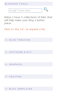
If I'm understanding correctly, you want a +/- sidebar title like my Blogging Tools area in my sidebar.


Each of the five titles marked +/- will expand a list of links. Note - to make it easier, do not expand the widgets templates. Scroll down to your sidebar wrapper. This is how mine looks:

Click for a larger view


Find the CSS style sheet. You will place the following code between the <b:section>and the </b:section>:
<b:widget id='LinkListXX' locked='false' title='+/- YOUR TITLE' type='LinkList'>
<b:includable id='main'>
<script type='text/javascript'>
//<![CDATA[
if(typeof(rnd) == 'undefined') var rnd = '';
rnd = Math.floor(Math.random()*1000);
rnd = 'id-' + rnd;
document.write('<a href="#" onclick="tmp = document.getElementById(&quot;' + rnd + '&quot;); tmp.style.display = (tmp.style.display == &quot;none&quot;) ? &quot;block&quot; : &quot;none&quot;; return false;">');
//]]>
</script>
<b:if cond='data:title'><h2><data:title/></h2></b:if>
<div class='widget-content'>
<script type='text/javascript'>
//<![CDATA[
document.write('<div id="' + rnd + '" style="display:none;">');
//]]>
</script>
<ul>
<b:loop values='data:links' var='link'>
<li><a expr:href='data:link.target'><data:link.name/></a></li>
</b:loop>
</ul>
<script type='text/javascript'>
//<![CDATA[
document.write('<\/div>');
//]]>
</script>
<b:include name='quickedit'/>
</div>
</b:includable>
</b:widget>
Changes to the above code:
  1. XX - the linklists are assigned a unique number. So, if you try to save your template and it says something about two widgets having Linklist3, change the number on one widget.
  2. +/- YOUR TITLE - Add the title of your sidebar widget here. You can leave the +/- if you want. It has become the universal symbol for Click here to see more.
Save your template and you have an expandable sidebar title.

EDIT: I have had this hack in my template for so long, I forgot to say you need follow Steps 1 & 2 in this post: Hide/Show, Expand/Collapse - navigation element. Those steps are:

First you must enter the following code in your style sheet:
.commenthidden {display:none}
.commentshown {display:inline}
Second put this between the <head> and </head> tags, but not in the style sheet:
<script type="text/Javascript">
function togglecomments (postid) {
var whichpost = document.getElementById(postid);
if (whichpost.className=="commentshown") { whichpost.className="commenthidden"; } else { whichpost.className="commentshown"; }
} </script>
I'm so sorry, Amy. I hope this clears up your problem!

post signature

Sunday, 8 June 2008

Add a border to your posts and sidebar

quotes1
I was wondering if you knew the code you had to place in the HTML so that all of your posts and your sidebar are in separate boxes.
quotes2

This is a fairly simple task. I'm working from the Minima template, so your template terminology may be slightly different. You will be looking for the sidebar area in your CSS style sheet.

Look for this in your template.
.sidebar .widget, .main .widget {
border-bottom:1px dotted $bordercolor;
margin:0 0 1.5em;
padding:0 0 1.5em;
}

.main .Blog {
border-bottom-width: 0;
}

Then you will replace it with this code:
.sidebar .widget, .main .widget {
background:#ffffff;
margin:1.5em 0 1.5em;
padding:8px 8px 8px;
border:1px solid $bordercolor;
border-bottom:1px solid $bordercolor;
border-width:1px 1px 1px;
border-bottom:1px line $bordercolor;
}

.main .Blog {
background:#ffffff;
margin:1.5em 0 1.5em;
padding:8px 8px 8px;
border:1px solid $bordercolor;
border-bottom:1px solid $bordercolor;
border-width:1px 1px 1px;
border-bottom:1px line $bordercolor;
}
That will give you a nice border around your posts and your sidebar widgets!

post signature

Tuesday, 3 June 2008

Free Calendar Icons!

Doug took matters into his own hands and created a cute little set of calendar icons to download for free! And they have the year stamped right on the image.


Want to add a calendar icon to your posts? Read this to get you on your way, Using a Calendar Icon as the Post Date Header.


post signature