Monday, 26 February 2007

Build a Blogger Mini-Site

Greetings,
I wanted to add a page separate from the home page.. The key is I want the page to use the style template and I would add as a link on a side nav. In essense I am trying to build a mini-site and still take advantage of blog features (and host the thing on blogspot! :)

Do you have recommendation on the best way to do this or are you aware of a hack for this? I know Wordpress offers this so I might switch to them.


My response was:
A while ago I made a separate page for a blogroll group. Look on my blog sidebar under 'Random Sidebar Clutter' and find +/- ::PowderPuff Geeks:: blogroll . Expand that section and click on ::Join PowderPuff Geeks:: That takes you to the other 'Mini-Blog' which has the same format (when I set it up) as BlogU. I included a 'Return Home' link at the bottom of the page. I did that by adding the following code in the post editor after the post:


<h2 class="sidebar-title"><a href="http://bloggeruniversity.blogspot.com"><< Return Home</a></h2>
You can see how it links from the sidebar in BlogU to the PowderPuff page.

To create a Mini-Site:

  1. Create a new blog, which will become your Mini-Blog.
  2. Copy your template from the main blog and paste it into a new blog.
  3. Remove the elements you don't want on the Mini-Blog, if any.
  4. Add the return home link as described above to the Mini-Blog.
  5. Add a link in the Main Blog sidebar to the Mini-Blog, and you are done.
Their response:


Aha! Brilliant, fake it with a new blog!!! Your suggestion is exactly what I was looking for.

Great job,
Mark


post signature

Sunday, 25 February 2007

Recent Comments Widget Fix

I thought I could sit back and relax while Blogger fixed the recent comments problem of displaying older comments. I was oh so wrong. The search was on. I finally found a way to correct it while the Blogger folk sit back and continue relaxing.

First off, don't worry about it if you are not using Han's recent comment widget. But, if you are not, I would hurry on over there and get it. Anyway, the fix came from Anakbrunei.

Open your dashboard/ Template/ Page Elements. Then click on 'edit' in your recent comment page element. Look until you locate this little part in the text.
http://yourblog.blogspot.com
/feeds/comments/default
?start-index=2&alt=json-in-script
You will add the text in red. All is better now!

Update 3/5/07: Thanks to x_piove, there is a fix for the missing most recent comment. Change start-index=2 to start-index=1

post signature

Friday, 23 February 2007

A Widebar Category Cloud and Sidebar Background Colors (From My Inbox)


Annie, i just discovered you and Girl, you are amazing! N one makes CSS understandable but you manage to :)
I've retired my yummy PSYCHO template because I can't use it with new Blogger and it's impossible to change. So, I learning to design my own and finding your BlogU so great. I have a couple of questions for you, if you have time, before I get started tweaking my template.

1) How did you make your category cloud one big space above the two sidebars?:)

Use a Widebar to hold your category cloud! And while you're at it, set your sidebars apart with a different background color.


2) Could I create background images for the sidebars? Or how would I make them a different color than the main part?

I hope you can answer these, but if not, I totally understand you're flooded with "help me" emails.

Blessings,
Heidi


1. How did you make your category cloud one big space above the two sidebars?

Follow the instructions on this post: A Widebar - Fluid Style which creates a new page element. You can add the label cloud there. (here is how to get the cloud My Category Cloud...Finally

2. Could I create background images for the sidebars? Or how would I make them a different color than the main part?

First, create a Variable definition:

Variable name="sidebarbgcolor" description="Sidebar Background Color"
type="color" default="#fff" value="#eeeeee">
Make the color anything you want.

Second, put the above code in the
/* Variable definitions
area of your template.

Third, to your #sidebar-wrapper add this code:
background:$sidebarbgcolor;
That will change the color of the sidebar.

post signature

Thursday, 22 February 2007

Rearrange the Sidebars (From My Inbox)

Sometimes a sidebar isn't where you want it. Maybe you want them side by side. Maybe not. You can put them where you want them.


Hello Annie

Thanks for your hard work - I'm a fan here's my problem: I have this blog Indie Waves and I need another sidebar (too much information just for one sidebar) but I cant get the new sidebar to go to the left of the main, I think it's a float issue, but I really cant figure it out.

Heres the code and here is the part that's making me crazy
If you could help me, I'll bake you a pie ;)

<div id='content-wrapper'>

<div id='main-wrapper'>
<b:section class='main' id='main' showaddelement='no'>
<b:widget id='Blog1' locked='true' title='Postagens no blog' type='Blog'/>
</b:section>
</div>

<div id='newsidebar-wrapper'>
<b:section class='sidebar' id='newsidebar' preferred='yes'>
<b:widget id='Label1' locked='false' title='Labels' type='Label'/>
</b:section>
</div>

<div id='sidebar-wrapper'>
<b:section class='sidebar' id='sidebar' preferred='yes'>
<b:widget id='BlogArchive1' locked='false' title='Arquivo do blog' type='BlogArchive'/>
</b:section>
</div>


If you move the following code as I arranged it below, that should take care of it. You end up with sidebar-posts-sidebar
<div id='content-wrapper'>

<div id='newsidebar-wrapper'>
<b:section class='sidebar' id='newsidebar' preferred='yes'>
<b:widget id='Label1' locked='false' title='Labels' type='Label'/>
</b:section>
</div>

<div id='main-wrapper'>
<b:section class='main' id='main' showaddelement='no'>
<b:widget id='Blog1' locked='true' title='Postagens no blog' type='Blog'/>
</b:section>
</div>

<div id='sidebar-wrapper'>
<b:section class='sidebar' id='sidebar' preferred='yes'>
<b:widget id='BlogArchive1' locked='false' title='Arquivo do blog' type='BlogArchive'/>
</b:section>
</div>
You can take this basic idea, and move your sidebar and main in any way you want. Experiment until you find and arrangement that you want.

post signature

Saturday, 10 February 2007

How to Make a Post Signature Using GIMP

Due to popular demand (Hi, Sissy!), I'm going to do a basic tutorial on using GIMP to make a post signature. So, if you don't have it, now is the time to download GIMP. While making your signature, keep in mind I'm not a GIMP expert, so this will be a very basic guide.

Let's get started! Open GIMP. This is what you will see.


You will notice all the icons at the top of the program. These are your tools. The brush is already indented. For the purpose of this tutorial, we are going to leave the brush choices alone, but if you care to change the brush size, texture or color, that is done in the lower half of the program. Change color by clicking on the black square that is over the white square and choose a color. Below that are a couple of areas that change the Mode (texture, design) of the stroke and Brush (brush style).

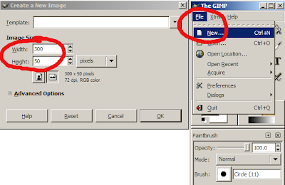
But, let's get back to making the sig. At the top click on File/ New and a 'Create a New Image' box opens. Here you can either select a template size or put your own in the 'Width/ Height' windows. I put in 300 x 50 for this tutorial. Click on 'OK' and that window closes and a new pallet opens called 'Untitled'. Not original, but it works!


Back to the top of the program. (see the next illustration)
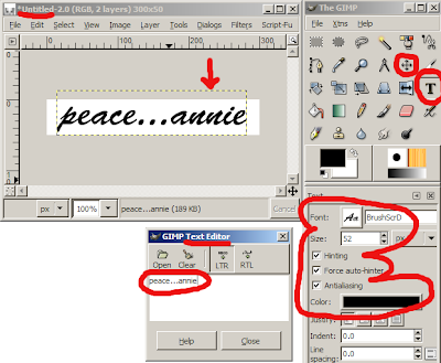
  1. Click on the T which opens up the 'Text Editor'
  2. Choose your font, color and size in the lower part of the program (the big fat red E)
  3. Put your cursor in the 'Text Editor' box and type your text. As you type you will see the text forming in the 'Untitled' box. You may have to adjust your size at this point. (look in the big red E)
  4. Another adjustment you will probably have to do is move the text around in the 'Untitled' box. To do this, in the upper part of the program (close to the T) click on the crossed arrows icon. The portion you move (called a layer) is within the orange and black dashed line.
  5. Put your cursor in the 'Untitled' box. It will do a number of strange things here. But, when you see it turn into an arrow and a diamond with 4 tiny squares, you can move that layer. If you mess up, just click on Edit/ Undo Move Layer in the 'Untitled' box. Try again.

Now all that is left to do is save your creation! You'll want to choose a file extension (I like png). It will probably say that "PNG can't handle layers"...click Export and next box OK. Believe me...it will be OK. Here is the one I made for this tutorial.

If you look at this post, Blogger Beta - Post Signature , it shows you how to put your signature in every new post!


post signature

Monday, 5 February 2007

Blogger Beta - Post Signature

I felt like something fun today. I wanted to pretty up my posts. Shane asked me if putting a signature in your post is possible. Well, it is, and here is one way of doing it!

You must first have a signature that you want to have at the bottom of your post. This signature will be in the form of an image. To get that image, you can look online for sites that help create signagtures, or you can make your own using GIMP as I did. If you need help making a signature, read some of my posts on design and graphics. After you have your signature, upload it to your web host...I use Ripway.

Open your Dashboard/ Settings/ Formatting/ Post Template. Put this code in the Post Template box:
<p><image class="centered"alt="post signature" src="SIGNATURE URL" /></p>
You can see my beautiful results below!

post signature